

Design comparison

Community feedback
- P@StroudyPosted 6 months ago
Hello again, Incredible work on this! You’re making great strides, and I have a couple of suggestions that might push it even further…
- Having a clear and descriptive
alttext for images is important because it helps people who use screen readers understand the content, making your site more accessible. It also improves SEO, as search engines usealttext to understand the image's context, helping your site rank better, Check this out Write helpful Alt Text to describe images,
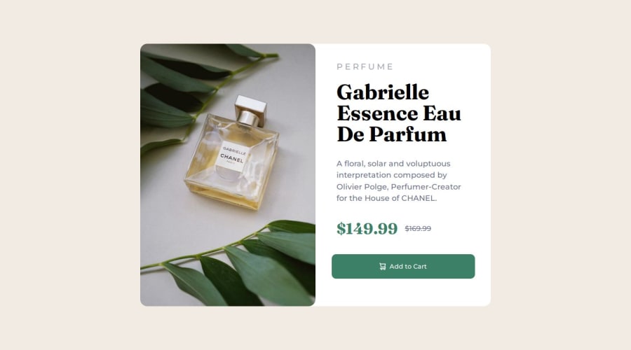
<img class="mobile" src="./Assets/images/image-product-mobile.jpg" alt="product-1❌"> <img class="dekstop" src="./Assets/images/image-product-desktop.jpg" alt="product-1❌">-
This should be in lowercase
<p>PERFUME</p>and styled in CSS withtext-transform: uppercase;, Keeping text lowercase in HTML improves accessibility and SEO. Usingtext-transform: uppercase;in CSS separates content from style, ensuring screen readers interpret the text correctly. -
You have wrapped all these elements on there own in a
<div>, There is no need for this as you can just style it just the same, If you had multiple elements in a div for layout purposes that's different but here you dont.
<div class="product type"> <p>PERFUME</p> </div> <div class="product title"> <h1>Gabrielle Essence Eau De Parfum</h1> </div> <div class="product description"> <p>A floral, solar and voluptuous interpretation composed by Olivier Polge, Perfumer-Creator for the House of CHANEL.</p> </div>-
Using
remoremunits in@mediaqueries is better thanpxbecause they are relative units that adapt to user settings, like their preferred font size. This makes your design more responsive and accessible, ensuring it looks good on different devices and respects user preferences. -
Line height is usually unitless to scale proportionally with the font size, keeping text readable across different devices. Best practice is to use a unitless value like
1.5for flexibility. Avoid using fixed units likepxor%, as they don't adapt well to changes in font size or layout. -
I think you can benefit from using a naming convention like BEM (Block, Element, Modifier) is beneficial because it makes your CSS more organized, readable, and easier to maintain. BEM helps you clearly understand the purpose of each class, avoid naming conflicts, and create reusable components, leading to a more scalable codebase. For more details BEM,
I hope you’re finding this guidance useful! Keep refining your skills and tackling new challenges with confidence. You’re making great progress—stay motivated and keep coding with enthusiasm! 💻
0 - Having a clear and descriptive
- P@asad102Posted 6 months ago
Looks great, the only one i mention is round the container and use overflow hidden instead of rounding the img
0


Please log in to post a comment
Log in with GitHub
Join our Discord community
Join thousands of Frontend Mentor community members taking the challenges, sharing resources, helping each other, and chatting about all things front-end!
Join our Discord