Design comparison
Solution retrospective
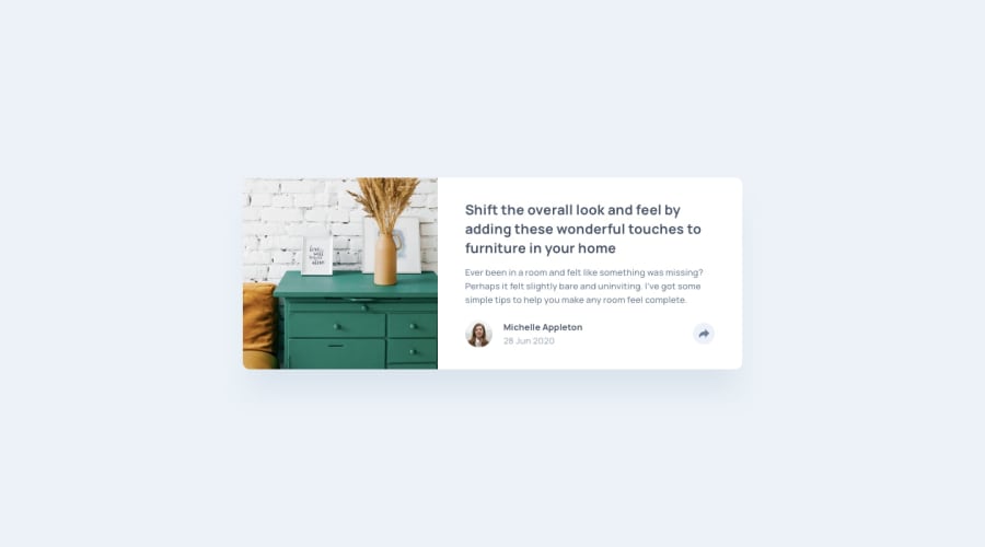
I kind strugle to make the share button work like it should in mobile view, so I adapted a little bit. PS( after i posted i noticed that i used the wrong colors. I already changed the colors but I can't retake any screenshot so it looks diferent than in the actual site)
Community feedback
- @pikapikamartPosted over 3 years ago
Hey, great work you got there. The layout in desktop is good and the button works fine. A suggestion for it would be that, adding another background-color to that button after it is clicked so that its color will pop out more and be contrasted.
The mobile is good as well and as you said, made a different approach for it in mobile.
Overall, you did a good job. But another to note, the pop out section for when the button is fixed, I think it will be better if that pop out is relative to the button. Because as I resize the browser, the pop out is going towards left because it is relative to the body. You might want to check that one out^^
0@S0NESPosted over 3 years agoHey, thanks for reviewing as always. i tried making relative to the button but I have overflow in the main tag so then the border won`t be overflowed. but the problem is that because of this the share div it cut
0
Please log in to post a comment
Log in with GitHubJoin our Discord community
Join thousands of Frontend Mentor community members taking the challenges, sharing resources, helping each other, and chatting about all things front-end!
Join our Discord
