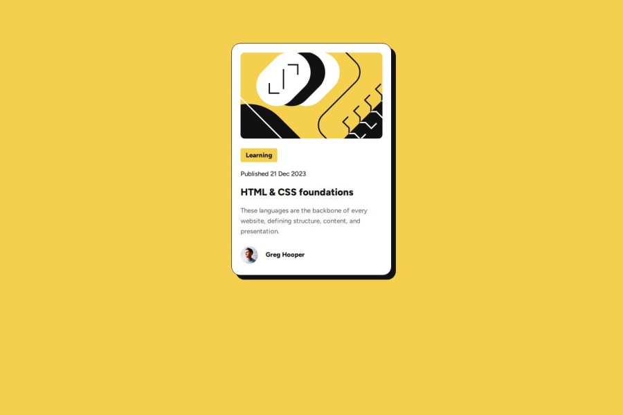
Responsive preview card with CSS Flex and HTML


Design comparison

Community feedback
- @nodegreecodePosted about 1 month ago
Basically, the component is fluid and very close to the design. And you didn't forget to set a border around the entire card, as I did. But regarding semantics and CSS styling, there are some things that you could improve. So the blog card consists of <header> with image, title and link inside of this, <p> with short description and the <footer>. Instead of adding :hover pseudo class on top of the <h1> better wrap an <a> tag with <h1>. The boxing-size property should be set inside the universal selector * only, as you do not use pseudo-elements ::after and ::before. They could be removed. If you set font-size entirely to 62.5% = 10px, then stick to rem's do not use px's, however for border-radius, px's are recommended, because corners remain the same after the user changes the font size in his browser. Using width and max-width in the .card class is redundant. You can leave max-width or use flex-basis instead. I hope my comment will be helpful. Stay motivated and keep coding...
Marked as helpful0

Please log in to post a comment
Log in with GitHub
Join our Discord community
Join thousands of Frontend Mentor community members taking the challenges, sharing resources, helping each other, and chatting about all things front-end!
Join our Discord