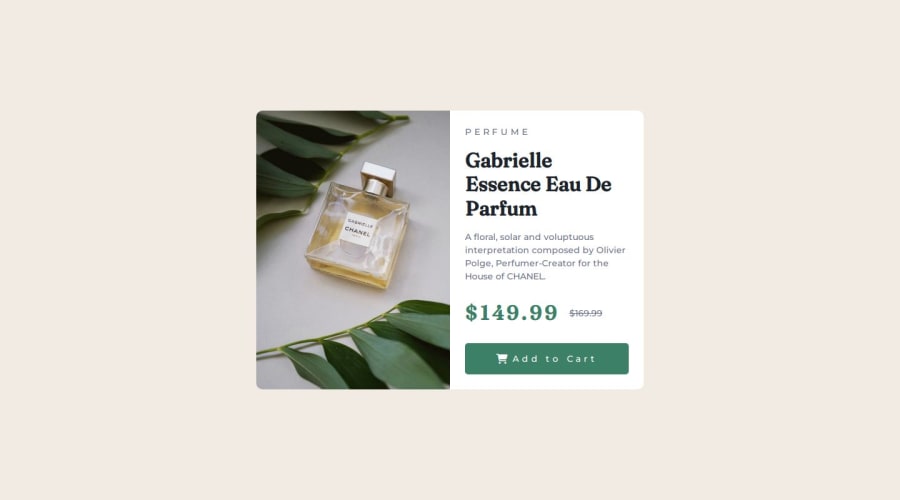
Responsive preview card using HTML5, CSS3 and CSS Flexbox.


Design comparison

Solution retrospective
I am most proud of my ability to use Flexbox to create the layout easily and making the website responsive on mobile screens down to 320px.
Next time, I'll make sure to check the styles required for responsiveness to determine basic sizing of main element and if my project will be better with a background image or the img tag.
What challenges did you encounter, and how did you overcome them?I first used an img tag, when I discovered the style on mobile will use a different photo. So I had to get rid of my img tag and put a section without content instead which I later placed the appropriate images with CSS, and over riding it on mobile by replacing background image with the one specified for mobile.
What specific areas of your project would you like help with?All of the challenges I faced I was able to solve, so I don't know if there is a problem with my code and will surely appreciate a feedback if any is found.
Community feedback
- @R3ygoskiPosted 12 months ago
Hello Havillah, great job, your project is very similar to the proposed design, it's perfect, congratulations!
Some tips, more related to semantic HTML, this section
<section class="image">, it would be more appropriate to use a<figure>, as its content is an image.And now about accessibility, this
<div class="cart">can indeed be a<div>, but it would be more correct to use a<button>. If you intend to keep it as adiv, it's more interesting for accessibility purposes to add the attributerole="button".Other than that, congratulations, your project looks very good, keep it up, you're doing great.
Marked as helpful0 - @1deadjoePosted 12 months ago
This is great work. I have tried the page on my phone and it works smoothly. You have included a piece of styling I totally don't have, media queries. Would you want to be my tutor on that? It is something I need a little help understanding.
0@HavillahAnyaPosted 12 months ago@1deadjoe I'm a beginner so my skills are still rusty. I can't really trust myself to teach you exactly as i'll need to.
Here's a video by traversy media that really helped me.
Google: Build a responsive website | HTML, CSS, Grid, Flexbox and more by Traversy media
0


Please log in to post a comment
Log in with GitHub
Join our Discord community
Join thousands of Frontend Mentor community members taking the challenges, sharing resources, helping each other, and chatting about all things front-end!
Join our Discord