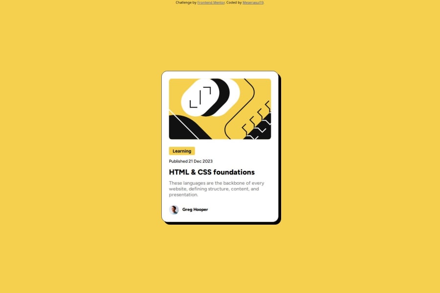
Design comparison
SolutionDesign
Solution retrospective
What are you most proud of, and what would you do differently next time?
I gain a lot of experience working with this project. Next time i think i should focus on the alignment part to make a better project.
What challenges did you encounter, and how did you overcome them?I found it difficult to manage the perfect sizes and fit the container on the right place. I'm not sure what unit is the best for responsive layout.
What specific areas of your project would you like help with?I'd like to get help with container centering, right units and if i used flexbox well.
Community feedback
Please log in to post a comment
Log in with GitHubJoin our Discord community
Join thousands of Frontend Mentor community members taking the challenges, sharing resources, helping each other, and chatting about all things front-end!
Join our Discord
