Submitted almost 3 years ago
Responsive Preview Card Component Using Flexbox
#sass/scss

@shamilussainc

Design comparison
SolutionDesign

Solution retrospective
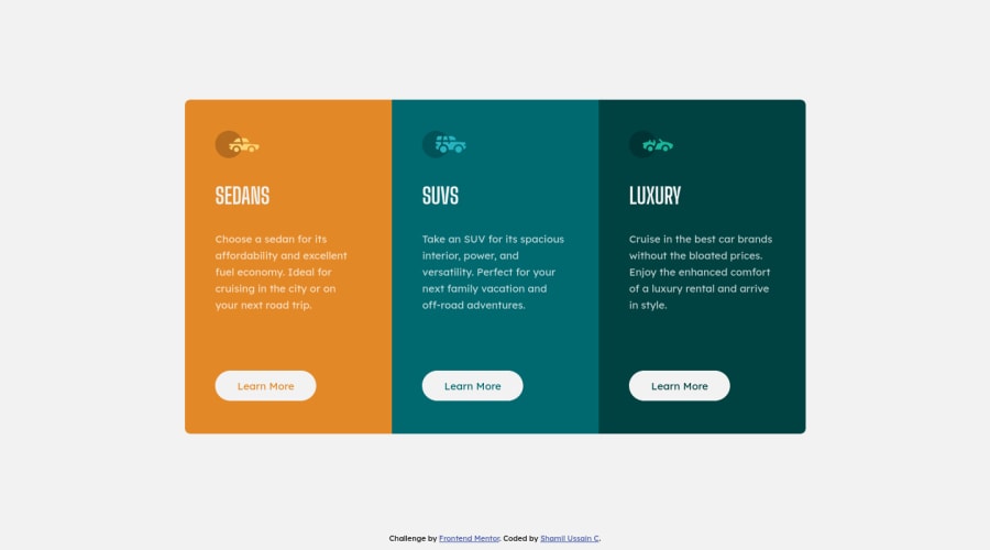
Hey guys, this is my 5th Frontend Mentor project. It's a responsive preview card component with 3 columns. Please take a look at my solution.
you feedback is valuable to me. thank you.
Community feedback
Please log in to post a comment
Log in with GitHubJoin our Discord community
Join thousands of Frontend Mentor community members taking the challenges, sharing resources, helping each other, and chatting about all things front-end!
Join our Discord