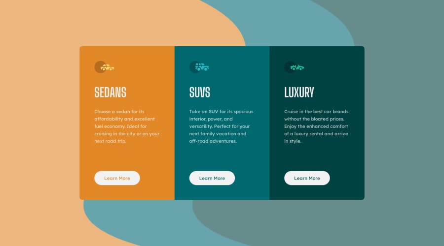
Responsive preview card component (JS, HTML, SCSS)
Design comparison
Solution retrospective
I enjoy adding effects and extending block actions. I added a flip side to the cards with additional info and a call to action. 😊
In the future, I plan to use JSON files more often. I feel like it would have been more convenient to store the content there in this case.
What challenges did you encounter, and how did you overcome them?I spent quite a while experimenting to find the perfect effect for displaying the flip side of the card. After some trial and error, I finally chose a smooth animation with a small touch of JS. 😅
I'm always excited to get any advice, notes, or even criticism—bring it on! It helps me grow, and I seriously appreciate it! 😄💡
Community feedback
- @psychederikPosted 5 months ago
Love that you went an extra step ahead and added that fitting background, awesome! It looks incredible 👍
0
Please log in to post a comment
Log in with GitHubJoin our Discord community
Join thousands of Frontend Mentor community members taking the challenges, sharing resources, helping each other, and chatting about all things front-end!
Join our Discord
