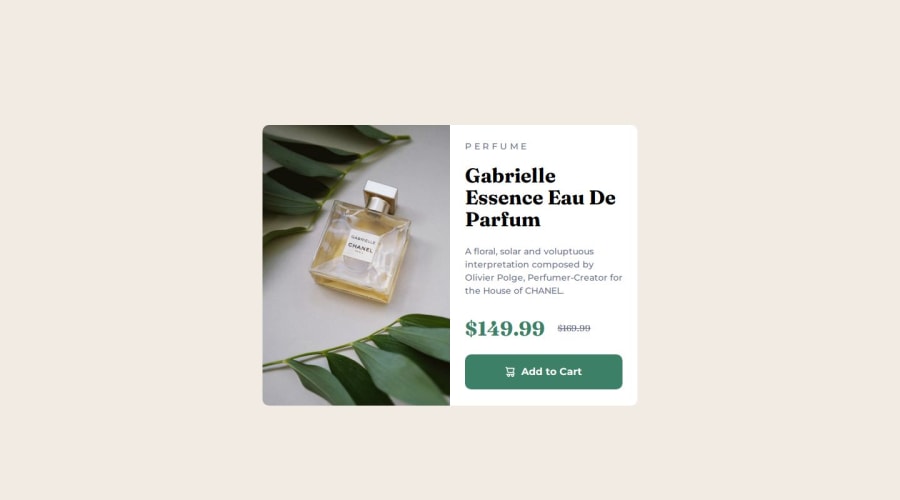


Design comparison

Solution retrospective
I got through the basic parts of it very quickly and that encouraged me
What challenges did you encounter, and how did you overcome them?It's easy to create framework, but hard to handle the responsive picture.
I found that the image was very large, so by default it needed a lot of space to really center the card, so I used the extra margin of the body to highlight the card.
body {
  display: flex;
  justify-content: center;
  align-items: center;
  /* creating space around card */
  margin: 1rem;

  background-color: var(--cream);
}
I think limiting the image size is a better option but I don't know how to do it. So what I did was just use media queries and picture element to switch to another image when it gets too big
<div class="card__img">
  <picture>
    <source media="(min-width: 600px)" srcset="./images/image-product-desktop.jpg">
    <img src="./images/image-product-mobile.jpg" alt="product image">
  </picture>
</div>
@media screen and (min-width: 600px) {
  .card {
    display: grid;
    grid-template-columns: 1fr 1fr;
    max-width: 600px;
    max-height: 449px;
  }
}
And I use block rather than inline-block on this challenge's button, because it looks the same width as the parent element. I really like this button :D
What specific areas of your project would you like help with?.card__button { display: flex; align-items: center; justify-content: center; gap: 10px; padding-block: 1rem; margin-top: 1.5rem; text-decoration: none; font-weight: 700; color: var(--white); background-color: var(--dark-cyan); border-radius: 10px; cursor: pointer; }
When switching to the large screen layout I found that the margin of the main text part could not support the entire right half. I didn't know how to deal with em units, so I finally decided to use fixed width and height. I hope there is a better way, thank you very much

@media screen and (min-width: 600px) {
  .card {
    max-width: 600px;
    max-height: 449px;
  }
}
And want to know how to keep the image at the same height as the parent element, even if the image needs to be stretched. If anyone has critical feedback please don't hesitate to let me know
Community feedback
- @NorimNoriPosted about 1 month ago
1. Responsive Image Handling:
Using the
<picture>element along with media queries to display different image sizes for different screen widths is a great solution. This ensures that users on various devices get the right image size, which is key for performance optimization.Suggestions:
- Instead of manually setting
max-widthandmax-heightfor the.card, I recommend usingobject-fit: coveron the image (if it's not already applied). This will ensure the image fills the container while maintaining its aspect ratio, preventing any distortion. - Additionally, you could use
max-width: 100%andheight: autofor the image inside.card__img. This approach would make the image scale properly within its parent container, especially on different screen sizes.
2. Body Layout and Centering:
I noticed that you used
flexon the body to center the card, which works well in most cases. However, the use ofmargin: 1remmight cause layout issues, especially on smaller devices. It could result in the card being too close to the screen's edges. Instead of relying on margin for spacing, I’d recommend using a grid layout on the body. This would make centering the card much more flexible and reliable across different screen sizes.Suggestions:
- Instead of using
margin: 1rem, I’d suggest usingplace-items: centerwithin a grid layout on the body to center the card. If you still want some spacing around the card, consider usingpaddingon the body or adjusting the grid layout properties to maintain consistent spacing.
3. Card Layout and Scaling:
For better responsiveness, use
vh,vw, or percentage-based values for width and height. Suggestions:- Instead of
max-width: 600px;andmax-height: 449px;for the.card, consider using a dynamic approach. For instance, you could usemax-width: 100%andwidth: 80vwfor the.card, which allows it to adapt to screen sizes more effectively.
.card {
  max-width: 100%;
  width: 80vw; /*The width of the card will be 80% of the width of the browser window. */
}
5. Understanding the
emUnit in CSSThe
emunit is a relative unit in CSS that depends on the font size of the element it's applied to. It's commonly used for font sizes, margins, paddings, widths, and other properties to create flexible and scalable layouts.How it Works:
- 1
emequals the current font size of the element. - It can be inherited from parent elements. If the parent has a font size of 16px, 1
emwill be 16px. - Nested elements multiply the
emvalues. If a child element hasfont-size: 1.5emand the parent is 16px, the child will have a font size of 24px (1.5 * 16px).
Why Use
em?- Scalability: Makes your design responsive to changes in font size, improving accessibility and flexibility.
- Inheritance: Allows for proportional scaling when elements are nested.
Example:
body {
  font-size: 16px; /* Base font size */
}

.container {
  width: 40em; /* 40 times the base font size (640px) */
  padding: 2em; /* 2 times the base font size (32px) */
}

h1 {
  font-size: 2em; /* 32px */
  margin-bottom: 1em; /* 16px */
}

p {
  font-size: 1em; /* 16px */
  margin-top: 1em; /* 16px */
}
Using
emfor Images:The
emunit can also be used to scale images, ensuring that they resize proportionally based on the surrounding text or container..image-container { width: 20em; /* Width of the container based on font size (320px if font size is 16px) */ } .image-container img { width: 100%; /* Make image fill the container */ height: auto; /* Maintain aspect ratio */ }In this example:
- The container has a width of 20
em, which will scale based on the base font size. - The image inside the container adjusts its width to 100% of the container, maintaining its aspect ratio.
You did a great job with your approach, and it’s clear you’re putting a lot of effort into this. Keep it up!
P.S.: I’m still learning responsive design myself, but this is what I’ve gathered so far. Feel free to dive deeper into other resources!
Happy coding 🚀!
Marked as helpful0@coyoteshkwPosted about 1 month ago@NorimNori Thanks again for your reply!
- I have tried using object-fit, but it didn't work. Until I used height:100% on wide screen, everything worked fine. The picture problem really bothered me for a long time
- I have used grid instead of flex and it works better, yeah ur right! :D I used margin on body just because flex layout made it full width.
- After that I researched other people’s code and ended up using max-width: clamp(19rem, 76.7vw + 3rem, 37rem); on the card and it worked fine responsively. You are right, using fixed height is not the best practice
- Thank you for explaining em! This helped me understand it more. Because I know it will scale with the font size of the parent element and could accidentally become too large, you gave me the right use case, which gave me confidence to use it correctly next time.
By the way English is not my native language so I used some google translator, if I said anything wrong please include it. You helped me a lot, wish you happy coding too!
0 - Instead of manually setting

Please log in to post a comment
Log in with GitHub
Join our Discord community
Join thousands of Frontend Mentor community members taking the challenges, sharing resources, helping each other, and chatting about all things front-end!
Join our Discord