Submitted over 1 year ago
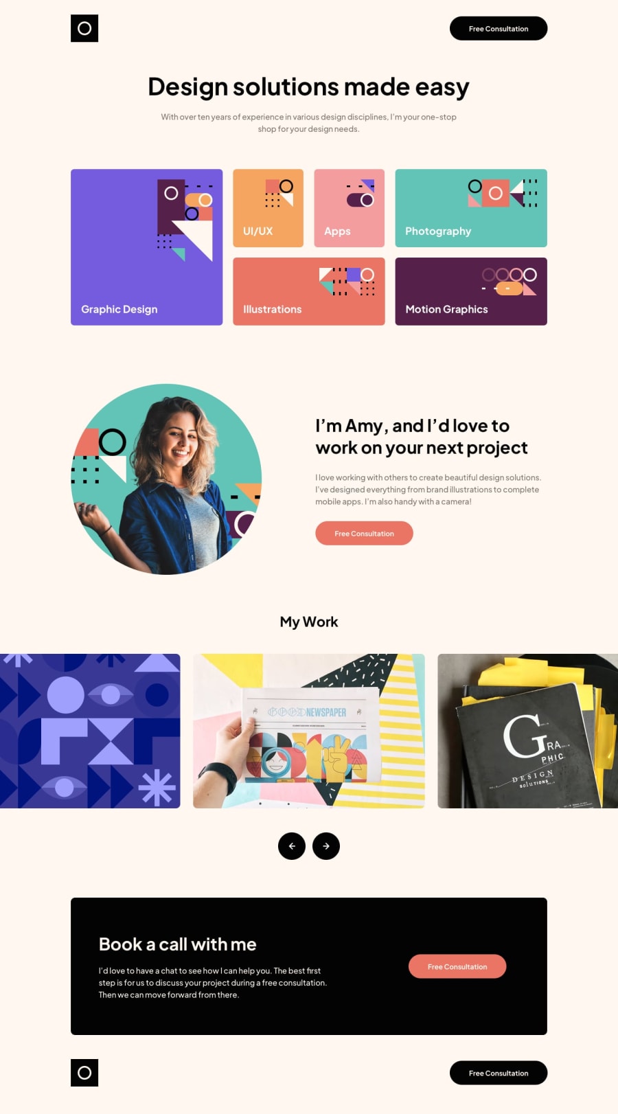
Responsive portfolio with working slider
#sass/scss
@giobooo
Design comparison
SolutionDesign
Solution retrospective
I was unable to make the slider work by swiping on the phone/touch devices (only by tapping the buttons). any suggestions?
Community feedback
- @vanzasetiaPosted over 1 year ago
Hi, Giovanni Brienza! 👋
I do not know how to make the slider works with touch screen.
I built the slider for this challenge using a third-party library, A11Y Slider - Library for simple and accessible sliders. By using that, I was able to make the slider responds to swipe gesture.
Here are some suggestions:
- Add alternative text to the logo: Logo is one of the ways for users to know the name of the site that they are visiting. So it is important to add alternative text to all logo images on the website.
- Link and button are different: What do you think will happen after a user clicking the "Free Consultation" button? If the user will navigate to another page, then an anchor tag should be used. If it triggers an action, then the button element should be used.
- Wrap the text with a meaningful element: For example, use a paragraph element to wrap the text. There should not be text in
<span>and<div>alone. - Use a list element to list all the skills: "Graphic design", "Illustrations", and so on are a list of Amy's skills. I recommend using a list element. Also, I recommend making the pattern for each skill as a background image.
titleattribute is not enough to label the buttons: I recommend having an alternative text on the arrow image that says, "Previous" or "Next". Or you can use anaria-labelattribute to lable each button for the slider.
I hope this helps. Happy coding! 😄
0
Please log in to post a comment
Log in with GitHubJoin our Discord community
Join thousands of Frontend Mentor community members taking the challenges, sharing resources, helping each other, and chatting about all things front-end!
Join our Discord
