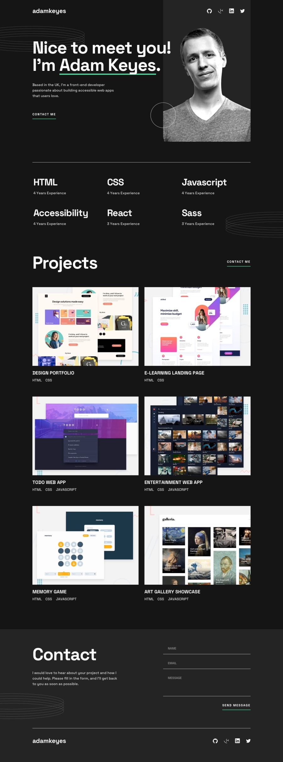
Responsive portfolio website using CSS Grid and JavaScript
Design comparison
Solution retrospective
I'm happy with most of the CSS Grid and Flexbox solutions I utilized for the site's layout, especially since there were some tricky bits (more so than I expected before digging into the project).
The CSS file here is fairly massive and if I went back and started this project again I would definitely use Sass to create more modular, manageable code.
What challenges did you encounter, and how did you overcome them?Positioning the decorative graphics was a pain. Basically just required a lot of absolute positioning trial and error on my part. I'm sure there was a better approach to take, but these challenges will be useful lessons learned for future projects.
What specific areas of your project would you like help with?The form validation I implemented is not ideal. My JS code is definitely bloated and not reflective of modern best practices. It's an area (forms in general) that I need to spend more time practicing.
Community feedback
Please log in to post a comment
Log in with GitHubJoin our Discord community
Join thousands of Frontend Mentor community members taking the challenges, sharing resources, helping each other, and chatting about all things front-end!
Join our Discord
