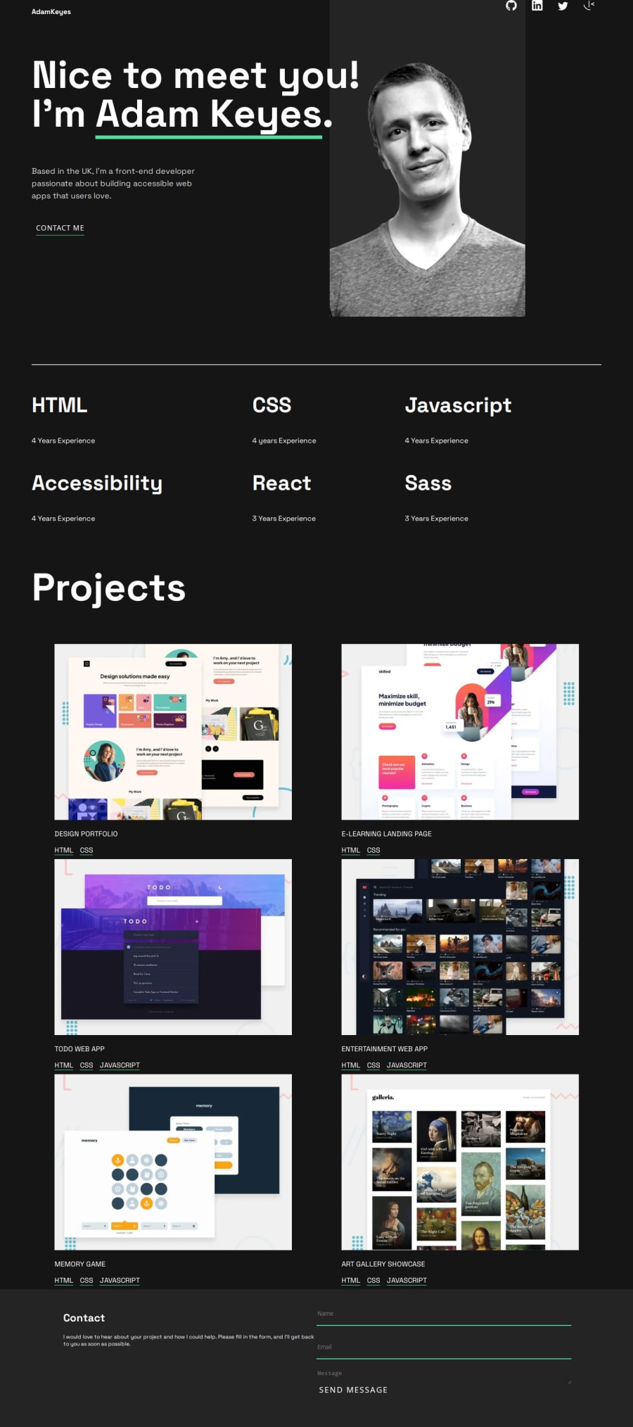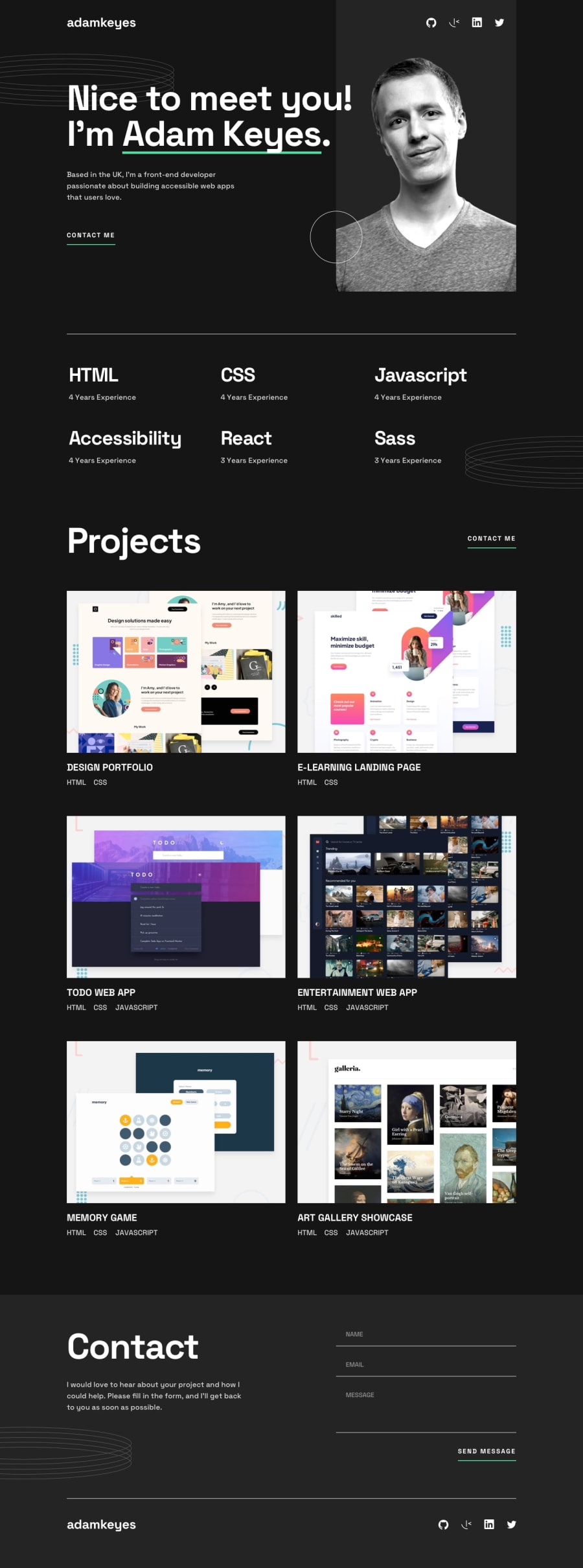
Design comparison
Solution retrospective
I’m proud of how I was able to implement responsive design in this project. Ensuring the layout adapts seamlessly to different screen sizes was a challenge, but I was able to achieve a smooth and consistent user experience across devices. Additionally, I focused on staying true to the original design from the Figma file, matching as many details as possible.
What challenges did you encounter, and how did you overcome them?The most challenging part of the project was creating the overlay for the project thumbnails. Getting the styling and positioning right, while making sure it looked good on all screen sizes, was tricky. It required a lot of trial and error to achieve the desired effect while staying true to the design from the Figma file.
What specific areas of your project would you like help with?I would like my code to be cleaner, though minimal, I believe there are some css tricks i could learn to reduce the amount code.
Community feedback
Please log in to post a comment
Log in with GitHubJoin our Discord community
Join thousands of Frontend Mentor community members taking the challenges, sharing resources, helping each other, and chatting about all things front-end!
Join our Discord
