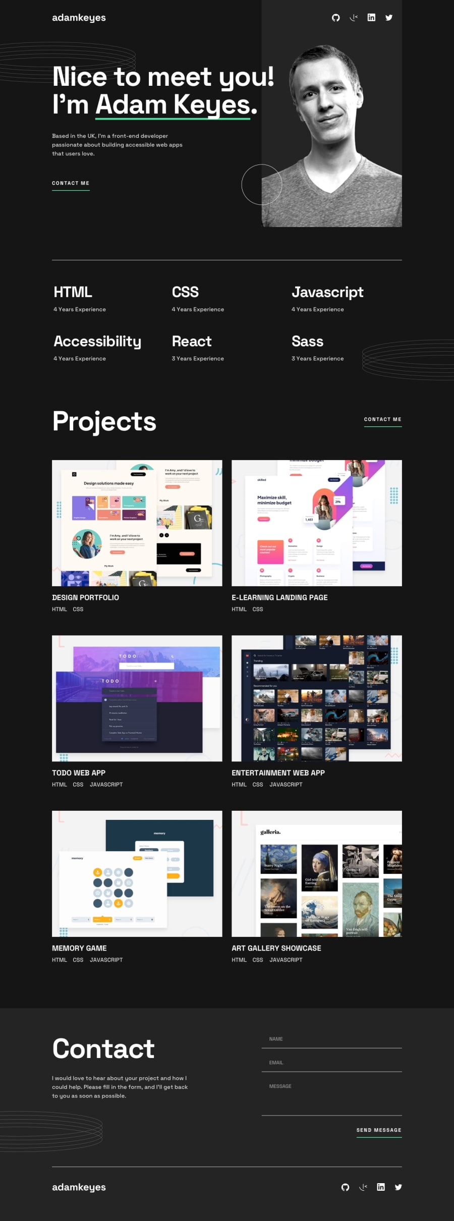
Design comparison
Solution retrospective
So i just finished this project and yet again i had a couple of difficulties and there are some "errors" too. So:
- the footer doesn't want to go all the way down (you can see the diffence in the color, the grey one is the footer).
- the whole hover on the project thing i'm not sure if i did it correctly or if there is a better and faster way (you can also see that the hover "shadow" "overflows" on the top and bottom side of the project image)
- the background decoration and profile picture i'm not sure again if i did it right, especially with the responsiveness of profile picture
- im having a hard time to position the nav bars (top and bottom)
And that's it I think. If you see anything else that's wrong please feel free to correct me. I'd help me a lot. Thank you!
Community feedback
- @oficial51Posted about 1 year ago
The problem in the footer is that you are not setting the height to a fixed amount which causes the container take only the space that the children take.
solution:
height: [The a amount you want];
Marked as helpful0@vovlaslPosted about 1 year ago@oficial51 ok but should i change the height three times then (one for the mobile, one for the tablet and one for the desktop) or is there a way to say "go to the bottom of the page"
1@oficial51Posted about 1 year ago@vovlasl unfortunately the best way is to set different heights, that way you make sure that it's better positioned.
However there is a property to put literally in the bottom. Probably not what you are looking for though.
position: absolute;
bottom: 0;
0
Please log in to post a comment
Log in with GitHubJoin our Discord community
Join thousands of Frontend Mentor community members taking the challenges, sharing resources, helping each other, and chatting about all things front-end!
Join our Discord
