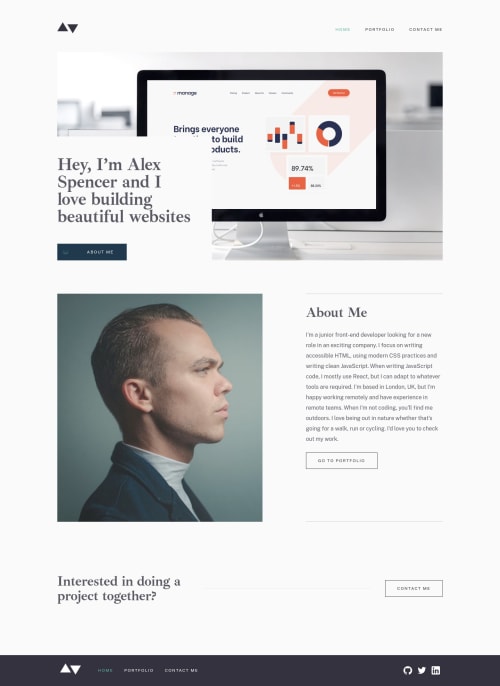
Submitted almost 4 years agoA solution to the Minimalist portfolio website challenge
Responsive portfolio site project
accessibility, eleventy, nunjucks, sass/scss, lighthouse
@imonaar

Solution retrospective
This is the most difficult challenge that I have attempted yet.
My first time using a static site generator, Eleventy and it involved a lot of learning and corrections. ooh and restarting the project over and over
I attempted to make it as accessible as possible. Getting a green score on lighthouse is reassuring.
The site is basically complete save for the projects where i still figuring out the tag system.
resources used are included in the code.
Comments and corrections are welcome
Code
Loading...
Please log in to post a comment
Log in with GitHubCommunity feedback
No feedback yet. Be the first to give feedback on kevin's solution.
Join our Discord community
Join thousands of Frontend Mentor community members taking the challenges, sharing resources, helping each other, and chatting about all things front-end!
Join our Discord