Submitted 7 months ago
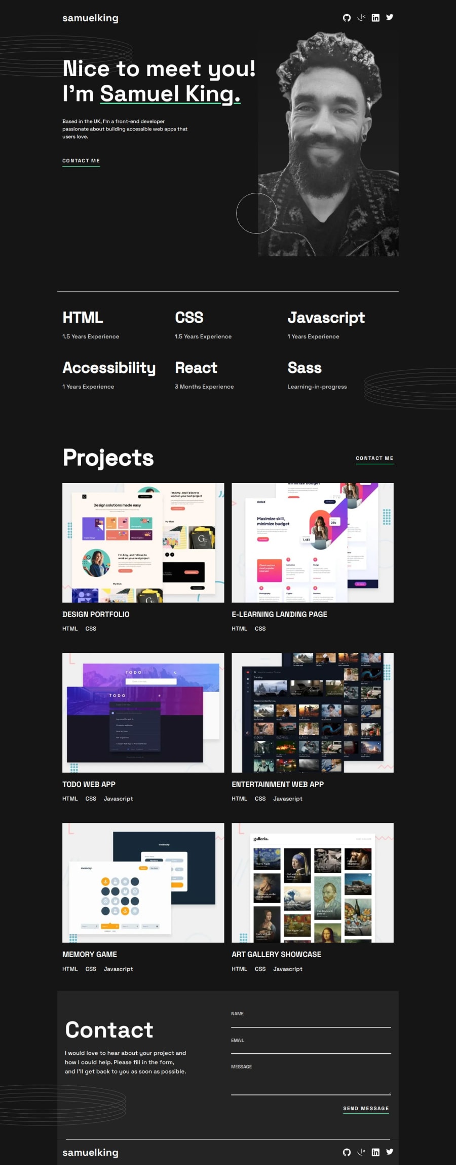
Responsive portfolio page styled for mobile, tablet and desktop
@SJK9476
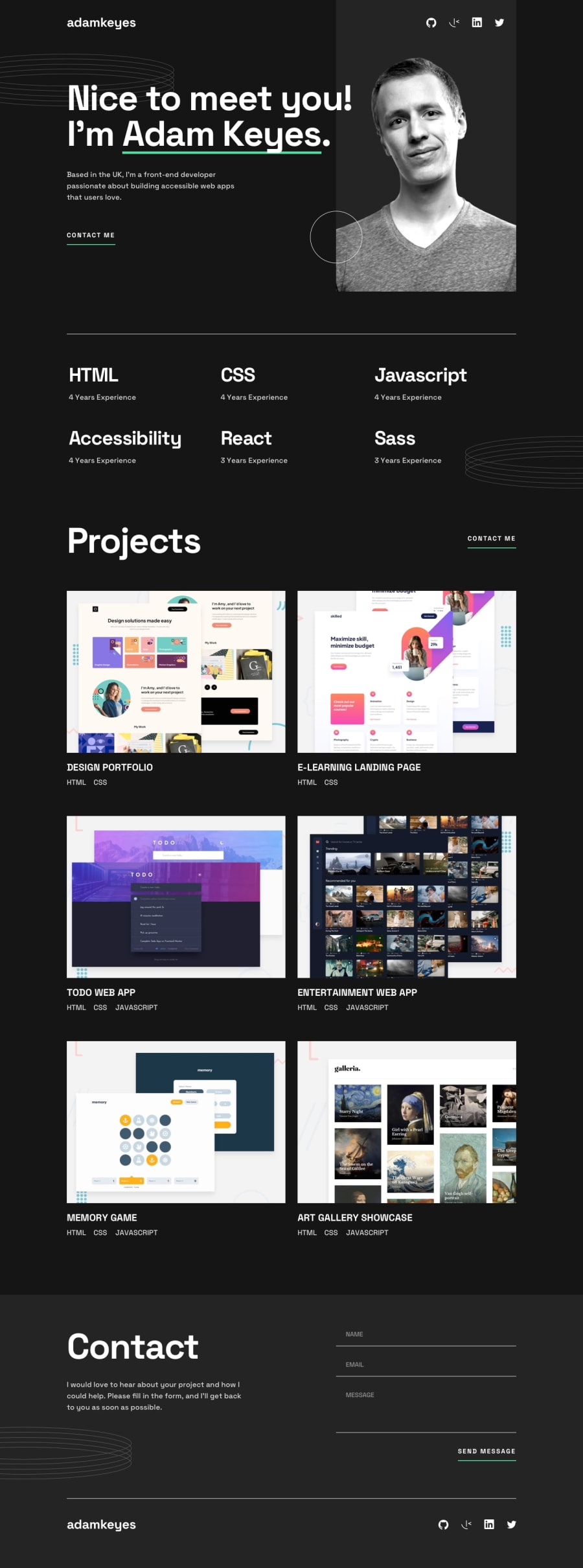
Design comparison
SolutionDesign
Solution retrospective
What are you most proud of, and what would you do differently next time?
This was a really fun build, having a figma design file to follow was a huge help and I'm happy with how it's turned out. I can definitely clean up my HTML class selectors and there were points where I thought the initial structure could have been better but overall extremely happy.
Community feedback
Please log in to post a comment
Log in with GitHubJoin our Discord community
Join thousands of Frontend Mentor community members taking the challenges, sharing resources, helping each other, and chatting about all things front-end!
Join our Discord
