


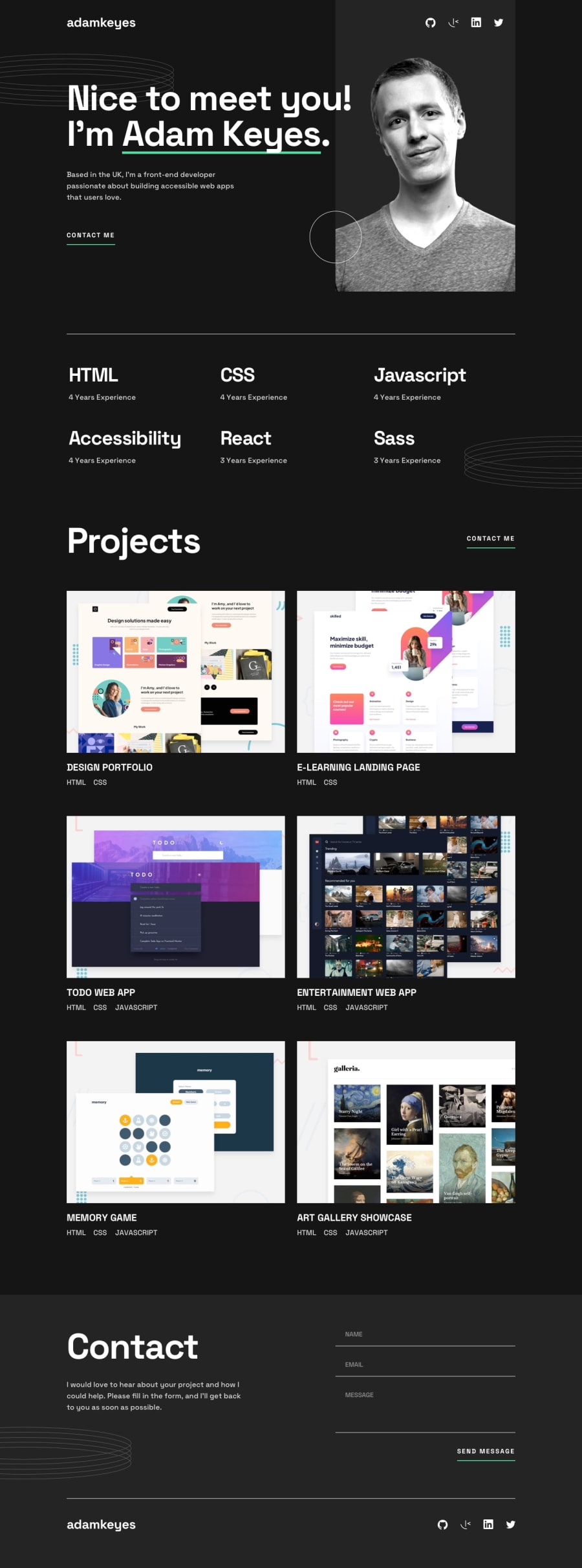
Design comparison
Solution retrospective
This project was very difficult for me. But I managed to finish it. I noticed some limitations that I will focus on to become more efficient. I also realized that I need to keep moving towards new technologies.
Community feedback
- @cuftamasterPosted over 1 year ago
hello José Valdir, i would like to ask u to approach page development a little bit differently
firs of all, modularity, u should look at the design and see are there repeating elements, and if there are group them in one class(selector), for example the first "contact me" element on page u did as a button, the second as a link and then u have ".links-under-the-project-images a", and all of them u styled separately. all of these could have been assigned one class, and styled with one selector in css.
i see u did separate logical sections of the page like header, abilities, projects and contact section, but then i se u using "hr" in-between even dough you used border bottom on the buttons/links, I'm guessing its because u didn't know how to keep that line the same width as the content above. common practice for pages that have content in the middle, with empty space on left and right is to use another div inside each section with a class="wrapper" that has a max-width and is centered, now this wont work if the parent of sections(body) doesn't have width 100% of the screen, so set it to 100dvw. again this is good for modularity of the page as all sections will contain a wrapper that is styled with one selector, and if u need to target specific wrapper u can by selecting parent(section) .wrapper {}.
u should learn some common practices moving forward learn what naming conventions are. specificity is a important one to learn, cause i sav 15 !important declarations if u structure your page well there should not be a need for it, on that note, u don't need to use id-s for styling with css, it needlessly raises the specificity of elements, making later correction in the css a nightmare . also learn basics of html and css before going to new technologies, because its important to understand how and why things work as they do.
a direct advice u have some problems on screans >750px and in device emulator, nothing is centered, all due to
<div id="end-page-patter-ring"> <img class="pattern-rings" src="/assets/images/pattern-rings.svg" alt="pattern-rings"> </div>if u put display:none on it, the problem is fixed, meaning "it" was the problem
i do hope this will help you progress on your way to becoming a developer. Best wishes!
Marked as helpful0 - @Aimal-125Posted over 1 year ago
Bro in your css code, increase the height of body element to 120 or 150vh by using media query with max-height: 400px; So that it looks good on small heighted screens as mine (samsung j3). Otherwise your solution is looking perfect!
Marked as helpful0


Please log in to post a comment
Log in with GitHub
Join our Discord community
Join thousands of Frontend Mentor community members taking the challenges, sharing resources, helping each other, and chatting about all things front-end!
Join our Discord