

Design comparison

Solution retrospective
-
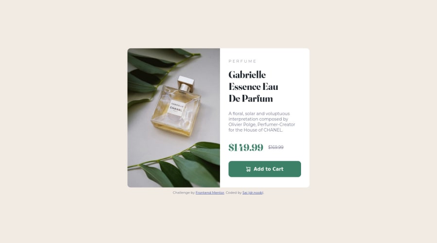
I didn't know how to change the product preview image automatically from mobile to desktop version, so I created a <img class="product-img"/> without the src attribute and used the content property in CSS to set the image, and used media query to change the image from mobile to the desktop version when needed. I've read that this isn't the best practice, are there any other alternatives?
-
I experimented a lot with widths and max-widths to get it the way it looks, not sure if this the best approach in regards to responsiveness.
-
Any best coding practices I should improve on? or Any mistakes in the way I approached the challenge (e.g. used wrong flex-box properties.... etc.)?
Thanks in advance (:
Community feedback
Please log in to post a comment
Log in with GitHub
Join our Discord community
Join thousands of Frontend Mentor community members taking the challenges, sharing resources, helping each other, and chatting about all things front-end!
Join our Discord