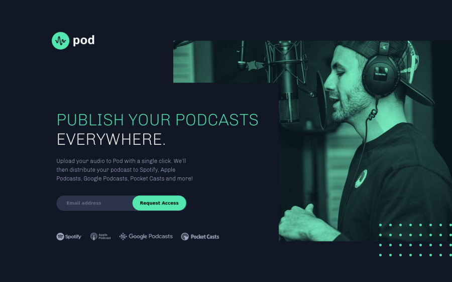
Design comparison
Solution retrospective
This is the first true responsive design I have done for desktop, tablet and mobile - so would appreciate opinions on what needs to be improved or best practice principles which need to be applied?
One thing i did not is the layout does look different on laptops - what is the usual breakpoint people use for laptop media queries?
All feedback welcome.
Community feedback
- @DanK1368Posted almost 3 years ago
I just uploaded the same challenge this morning. It was fun, and i think you did a good job.
To get rid of the issues in the report you should update the alt attributes for the images in case they cannot be displayed.
I also noticed that when viewing your page on my mobile phone, the image of the host is almost gone. I would adjust the opacity of the overlaying color for the image to come out more.
I usually start around 960px to above 1000px to do the layout for the laptop. However, I think its generally better to adjust the layout as soon as there is enough space for the content to fit for the desktop version. Once the layout starts to look awkward as you grow the window you should add changes, i think it will make the overall transition look nicer too. :)
Marked as helpful1@Li-BeePosted almost 3 years ago@DanK1368 thanks! Have made the changes to opacity and fixed the html/accessibility issues. Appreciate your view in regards to laptop breakpoints.
0
Please log in to post a comment
Log in with GitHubJoin our Discord community
Join thousands of Frontend Mentor community members taking the challenges, sharing resources, helping each other, and chatting about all things front-end!
Join our Discord
