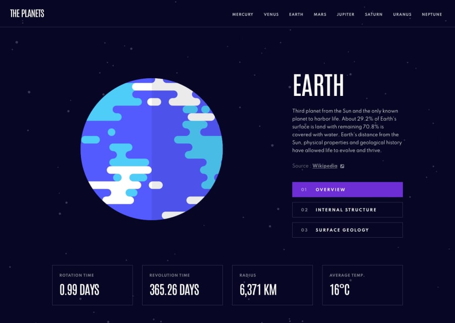
Design comparison
SolutionDesign
Solution retrospective
Creating nav items with different colors and tabs (overview, structure, surface) matching each planet's color was a bit tricky. I'm not sure I implemented the animation correctly and the transition between routes is not very smooth. When the same component re-renders, the animation isn't triggered. I included a page not found component. Check out the route /planets/Pluto :D
Question: How can I improve the mobile hamburger menu? It's opening smoothly but closing too abruptly.
Any feedback and criticism is welcome! Thank you!
Community feedback
Please log in to post a comment
Log in with GitHubJoin our Discord community
Join thousands of Frontend Mentor community members taking the challenges, sharing resources, helping each other, and chatting about all things front-end!
Join our Discord
