Design comparison
SolutionDesign
Solution retrospective
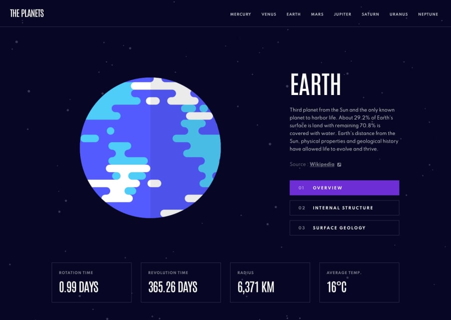
This was my first attempt at using NextJS. I learned that for this App I was probably better of not using it as it turned out to be a single page application. Let me know what you think and how I can improve!
Community feedback
- @savvystriderPosted over 1 year ago
Looks good! You nailed the look and feel of the desktop design.
My comments, hope you find them useful:
- For some reason, the fonts and hover/focus states aren't displaying properly.
- You have the images switched for the Structure and Surface Geology sections. You might have to put the font names in quotes.
- The desktop version should have the buttons labelled as "Internal Structure" and "Surface Geology" and the mobile version should have them labelled as "Structure" and "Geology."
- Mobile images should be scaled/responsive.
- Hamburger icon seems a bit out of place and the mobile navbar should be full width.
0
Please log in to post a comment
Log in with GitHubJoin our Discord community
Join thousands of Frontend Mentor community members taking the challenges, sharing resources, helping each other, and chatting about all things front-end!
Join our Discord

