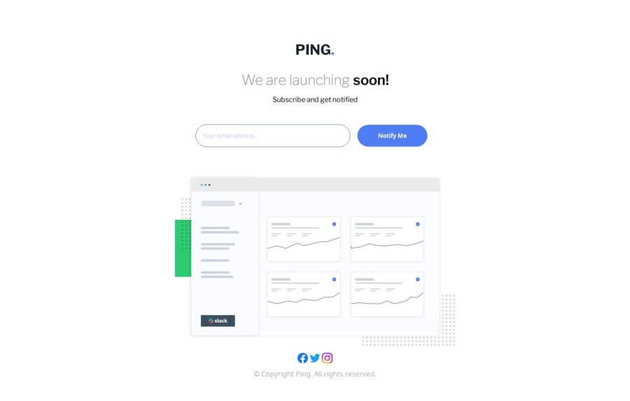
Design comparison
SolutionDesign
Solution retrospective
What are you most proud of, and what would you do differently next time?
I am slowly doing my projects with a mobile-first approach, practicing good JS, and CSS skills. There is a lot to improve. I couldn't handle the part where you click the button, the position of the input part is changed a little bit, it is ok in the mobile version, but not in the desktop version. So I would love to read if you have any suggestions about that
Community feedback
Please log in to post a comment
Log in with GitHubJoin our Discord community
Join thousands of Frontend Mentor community members taking the challenges, sharing resources, helping each other, and chatting about all things front-end!
Join our Discord
