Submitted over 1 year ago
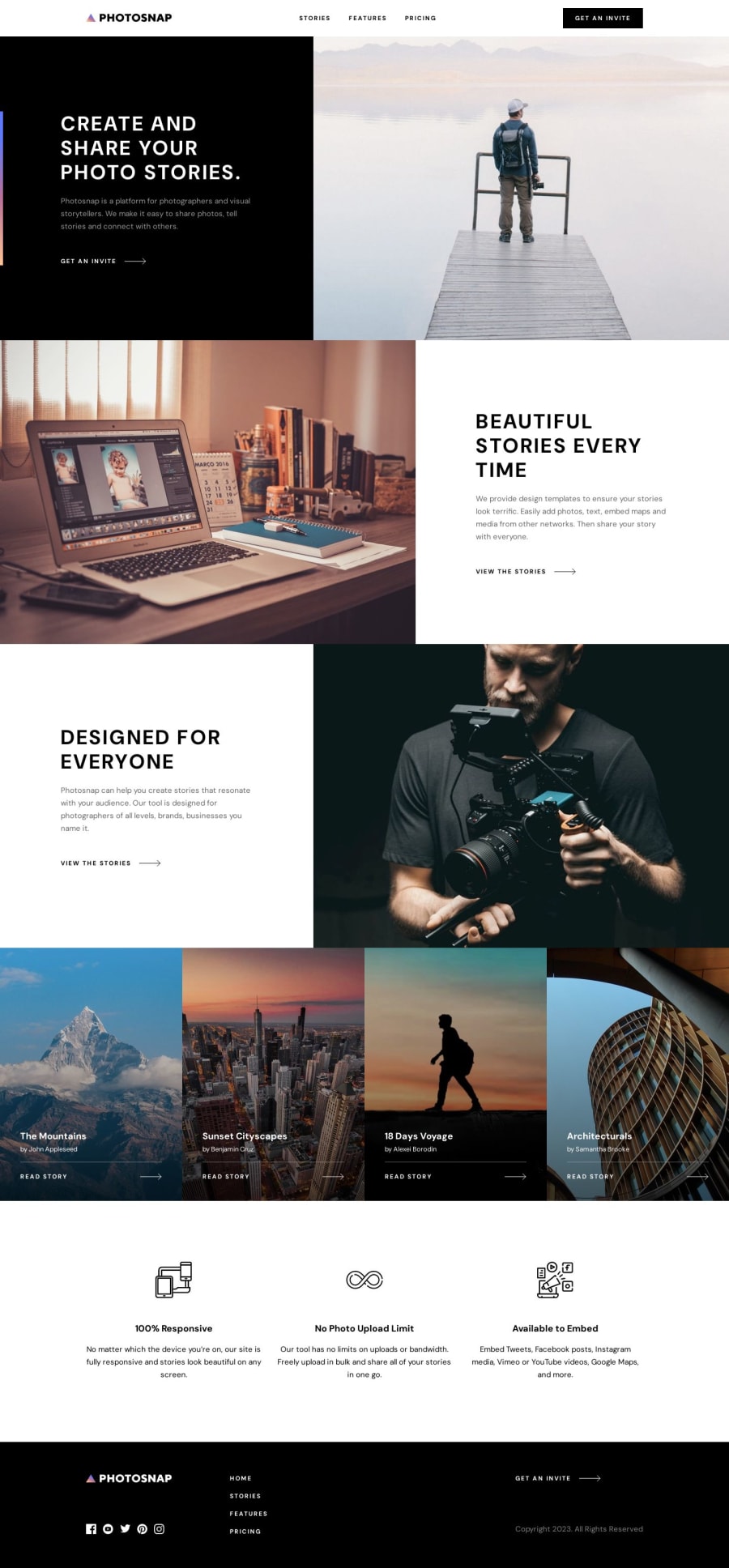
Responsive Photosnap multi-page site using React
#react#styled-components#typescript#vite
@Isaiah-B
Design comparison
SolutionDesign
Solution retrospective
This was mainly a way to practice with responsive layouts for a page with several varying components. I still learned a lot though and picked up a few new tricks. Please let me know what you think might look good, or if something could be improved!
Community feedback
Please log in to post a comment
Log in with GitHubJoin our Discord community
Join thousands of Frontend Mentor community members taking the challenges, sharing resources, helping each other, and chatting about all things front-end!
Join our Discord
