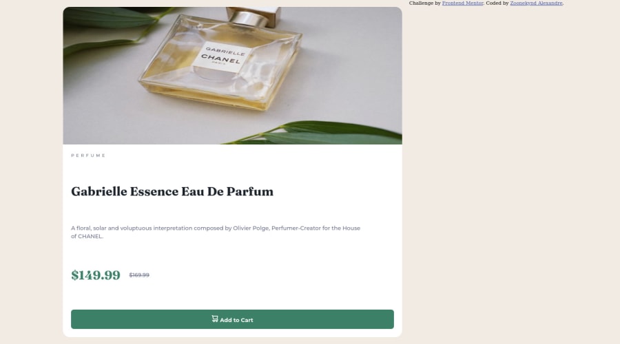
Design comparison
Solution retrospective
Hey everyone, I completed this challenge. Can you please check it out and let me know some feedbacks and advices to improve my code.
Thanks
Community feedback
- @iamenochleePosted over 2 years ago
Your media-query kicks in late, leaving your solution to stretch all the way to 1500px, reduce this to 900px, also add this style.
@media screen (min-width: 500px) and (max-width: 900px) {
.container {
padding: 10em;
}
button {
margin-bottom: 1em;
}
I see you made use of semantic elements and relative unit, good job, you should also start approaching layout from a mobile-first approach. Keep Coding
Marked as helpful1 - @fedementrePosted over 2 years ago
Hi! Good job, there are a few things you could improve. I'm not very good at it but I can still give you some tips that I hope will help you:
-
Try to put the entire CSS code inside a style document and avoid using inside html, this will help you to put things in order and better identify any errors and possible solutions.
-
excellent use of wrap, sometimes I forget it exists
-
the image appears stretched, try inserting
object-fit: cover; -
the desktop view appears wrong because you have set a high max-width of the media queries, try setting a lower max-width, a mobile device usually has a lower max-width (for example, the iPhone SE has a screen width of 375px)
For the rest I don't feel like giving any other advice, also because as I said I'm not a super expert, but I hope I've helped you in some way. <3
1 -
Please log in to post a comment
Log in with GitHubJoin our Discord community
Join thousands of Frontend Mentor community members taking the challenges, sharing resources, helping each other, and chatting about all things front-end!
Join our Discord
