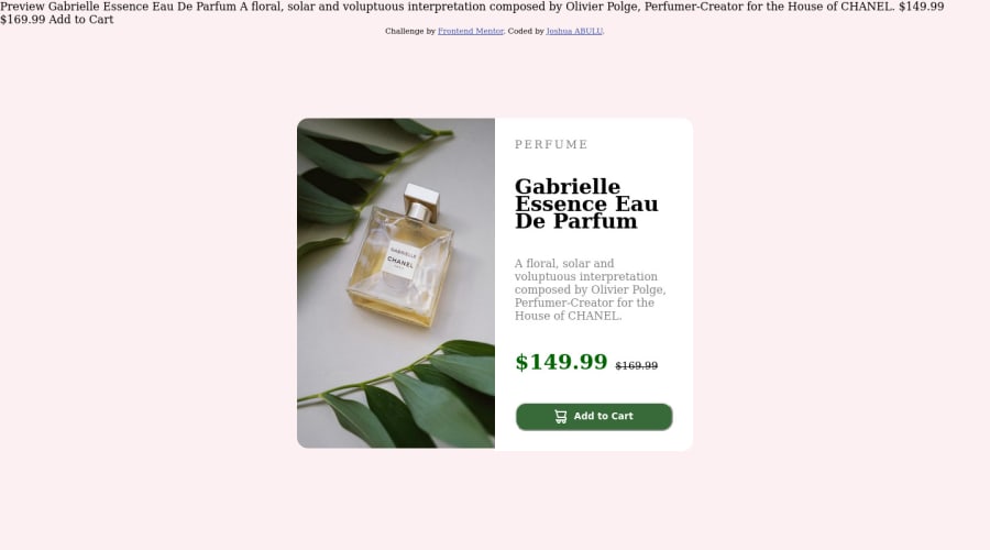
Design comparison
Solution retrospective
Since the images for desktop view and mobile view are different, I had a hard time changing the images when viewing on different devices.
Community feedback
- @HassiaiPosted almost 2 years ago
Replace<div class="container">with the main tag, <h3> with <h1> and <div class="attribution"> with the footer tag to fix the accessibility issues. click here for more on web-accessibility and semantic html
Every html must have <h1> to make it accessible. Always begin the heading of the html with <h1> tag wrap the sub-heading of <h1> in <h2> tag, wrap the sub-heading of <h2> in <h3> this continues until <h6>, never skip a level of a heading.
The body has a wrong background-color. Use the colors that were given in the styleguide.md found in the zip folder you downloaded.
To center .container on the page using flexbox or grid instead of margin,
- USING FLEXBOX: add min-height:100vh; display: flex; align-items: center: justify-content: center; to the body
body{ min-height: 100vh; display: flex; align-items: center; justify-content: center; }
- USING GRID: Add min-height:100vh; display: grid place-items: center to the body
body{ min-height: 100vh; display: grid; place-items: center; }
Use relative units like rem or em as unit for the padding, margin, width values and preferably rem for the font-size values, instead of using px which is an absolute unit. For more on CSS units Click here
For a responsive content use the picture tag for the image <picture> and give .container a fixed max-width value .
max-width:500px
. there is no need to give .container a height value rather give .description a padding value for all the sides.Hope am helpful.
Well done for completing this challenge. HAPPY CODING
Marked as helpful0 - @sumanth-chandanaPosted almost 2 years ago
Hi JOSHUA ABULU!, congrats🎉 on completing the challenge. Better take care about following points.
- Check the
background-color
of your page and you can remove the content which is extra on the top of the page. - Always check Frontendmentor Report Generator issues after submitting the project for removing errors and warnings.
- Use the
alt
(alternate text) attribute as mentioned in your Accessibility Report.alt
attribute is used for Screen readers applications. - Why does alt attribute matter? Read here.
- To avoid accessibility issues "All page content should be contained by landmarks" use code as :
<body> <main> ---your code here---- </main> <footer> </footer> </body>
(why does
<main>
matter? Read here )- For proper centering the container(whole card) vertically and horizontally you can also use the following simple block of code use code:
body { min-height: 100vh; display: grid; place-content: center; }
- When we open the GitHub repository link, you will find an About Section on the right side. There, also include a live preview link of your project. It is better for someone to check your live project while interacting with code.
I hope you will find this Feedback Helpful.
Marked as helpful0 - Check the
- @heisemmaco-devPosted almost 2 years ago
Hi Joshua,
i really like the way you structure the html but in the document from frontend mentor, their is another text their already for you to structure you didn't need to add another text, you can that is why their is some text their already.
secondly you didn't use the right background color and you can see that right side of the card is higher than one another, i think you added padding to the wrap tag in html.
about the font their is alway a type of font they described the style guild and alway make use of the style guild.
i hope you find this very useful
Marked as helpful0
Please log in to post a comment
Log in with GitHubJoin our Discord community
Join thousands of Frontend Mentor community members taking the challenges, sharing resources, helping each other, and chatting about all things front-end!
Join our Discord