Not Found
Not Found
Not Found
Not Found
Not Found
Not Found
Not Found
Not Found
Not Found
Not Found
Not Found
Not Found
Not Found
Not Found
Not Found
Not Found
Not Found
Not Found
Not Found
Not Found

Submitted

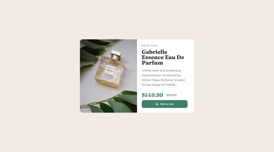
Responsive Perfume Card Component built using CSS grid & @media

@StudentForEternity

Desktop design screenshot for the Product preview card component coding challenge

This is a solution for...

  • HTML
  • CSS
1newbie
View challenge

Design comparison


SolutionDesign

Solution retrospective


Hi! :)

Community feedback

P

@mfkutz

Posted

hello!! do you have 2 identical MQ, for something special? you can put everything inside one, it is also recommended to put some css under them (media queries) good job!

0

@StudentForEternity

Posted

@mfkutz Thank you for commenting :) I could be wrong, but here is my reasoning,

I have 2 media queries but they are not identical. One is for btn CSS rules to change based on width and the other changes the whole component's CSS rules and image based on width.

I could have just one media query in the very end of my CSS but I was taught to create a media query immediately after creating a CSS rule. To basically have all my btn rules for all width sizes at one place, and all my component rules together at another place, and so on.

0
Joachim 840

@Thewatcher13

Posted

HTML

  • there should be a main landmark element in your html
  • Why do you have a div that is closed in the same line class=product img?
  • You can't have more than one h1 on a project
  • for the old price use the s tag in html
  • you should use the picture element in your html for your pictures, place them not in the css and absolute not as a background...it is no background..Just a product photo.

CSS

  • Why do you have a strong element in your css as selector? You haven't one in the html..
  • dont set font size in absolute values (px) but in relative values (rem) https://fedmentor.dev/posts/font-size-px/
  • set your media query in rem to instead of px
  • Use a css reset (in every project) look on Andy Bell his website for a good and clear one
0

@StudentForEternity

Posted

@Thewatcher13 Thank you very much for providing feedback :)

You are right about landmark elements in my html. My weakness is HTML, I use div on everything. I'll try to pay more attention to it. But I didn't have main tag because I saw this challenge as just a small component that needed to be added into a bigger project. So I assumed that it should be a div and not a main

I used div for img because I needed to use background-image. I had to have one image for mobile width and another image for desktop width (per instructions) I don't know how to change images through @media query if the image is inside html. With background-image, I can keep images inside CSS. I'll try to look up another way to change image src through @media.

I didn't know that we can't have more than one h1 in a project.

I have strong element in my CSS just as general rule, I want to make it a habit to specify strong's font-weight: 700. Because the person I learned CSS from said to always specify strong's font-weight as general CSS rule. He also said to use px for @media's min-width and rem/em for everything else.

My font size values in body is in px just cause the project's style guide specifically asked for font-size to be 14px. But I'll try to use google to translate all px to rem.

Not sure what css reset is, I'll look it up.

0
Joachim 840

@Thewatcher13

Posted

Be sure you read the links that you get, but a few things.

  • The pictures should be include in your html with the picture tag

SOURCE --> https://web.dev/learn/design/picture-element/

  • If you're not good at HTML this is a good way to start

SOURCE -->https://web.dev/learn/html/

  • Your font-size should be calculated like this: font size in px / 16 = your rem value (we use 16 bcs it's the standard font-size in the most browsers)

SOURCE -->https://fedmentor.dev/posts/font-size-px/

  • The thing about set the strong element standard in the css is new to me...but I don't think it should be there, why should it be there if you don't use a strong element in your html?

  • The css reset

SOURCE -->https://andy-bell.co.uk/a-modern-css-reset/

A reset is used because, every browser has is own stylesheet already (that is why an h1 have a big size and bold, without any line of code in css written by yourself.) But every element has also a default padding, margin and for more control on that, we reset the browser styles with that reset.

Webdev is a long way to learn, keep going.

0

Please log in to post a comment

Log in with GitHub
Discord logo

Join our Discord community

Join thousands of Frontend Mentor community members taking the challenges, sharing resources, helping each other, and chatting about all things front-end!

Join our Discord