Design comparison
Solution retrospective
I'm proud that i was able to complete the project in a timely and accurate manner. I do have some background knowledge and its been nice to work on this project. Especially getting to work with Figma designs.
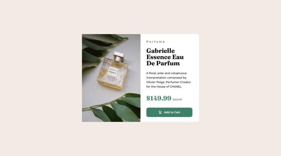
What challenges did you encounter, and how did you overcome them?My biggest challenge was getting the card to display with the image on the left side but also have the text display vertically. Using the developer tools in the browser i was able to test things out and what i ended up doing was creating a new div for all my text elements and using flexbox.
What specific areas of your project would you like help with?The media query section specifically the background image as it appears to be blurry. Also, anything else that is helpful would be nice I'm open to any suggestions.
Community feedback
Please log in to post a comment
Log in with GitHubJoin our Discord community
Join thousands of Frontend Mentor community members taking the challenges, sharing resources, helping each other, and chatting about all things front-end!
Join our Discord
