Design comparison
Community feedback
- P@ikitamalarosePosted 8 months ago
Congratulations on the work done.
I invite you to document yourself on
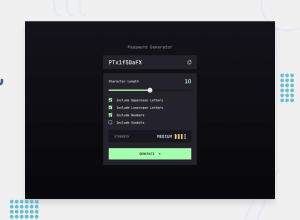
mousedownandtouchstartto make the customise slider. Then depending on the position, put the password strenght.Use div or button containing the icon to customise to create your own checkboxes.
Blocked the copy option when there is nothing in the password field.
Reduce the width of the main block.
You can take a look at the work i did to get an idea of all this.
:)
Marked as helpful1P@kayan2004Posted 8 months agoThanks man, I know it wasn't the best but I was bored trying to figure out how to style checkboxes and the slider so i just wrote the javascript code and submitted it haha. Thank you for the advice!@ikitamalarose
0
Please log in to post a comment
Log in with GitHubJoin our Discord community
Join thousands of Frontend Mentor community members taking the challenges, sharing resources, helping each other, and chatting about all things front-end!
Join our Discord
