Design comparison
SolutionDesign
Community feedback
- @mohamedmostafaoudaPosted over 1 year ago
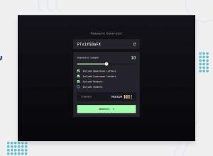
👋 Hey, great job on your submission! 💯 However, I have some concerns that I wanted to share with you:
- The form is wider than the design. 📏
- If you check a checkbox and then uncheck it, the password still appears strong even when all checkboxes are unchecked and the character count is 0. 🤔
- The password generator doesn't work by simply pressing the button; I have to press "Generate" for it to work. 🤷♀️
- Changing the character count doesn't affect the password strength. 🔢
- I have to click on the checkbox to make it work, but it would be more convenient if I could click on the checkbox label and the box as well. 🙏
- When I hover over the button, a strange box appears around the word "Generate." 🤔
Despite these concerns, I want to say that your design is really great and the password generator works like a charm! 👏 Great job!
Marked as helpful0
Please log in to post a comment
Log in with GitHubJoin our Discord community
Join thousands of Frontend Mentor community members taking the challenges, sharing resources, helping each other, and chatting about all things front-end!
Join our Discord
