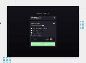
Design comparison
Solution retrospective
Proud to complete my first intermediate project. The javascript was pretty interesting to get into and lots of different aspects to consider. I'm not sure there is much I'd do too differently, i decided to do the JS first which helped. There was a bit of changing of html and js after styling though, not too sure if that could've been helped.
What challenges did you encounter, and how did you overcome them?Not too much challenges really, had a bit of trouble getting the custom input radiobox to style, and spent quite a bit of time trying to get the differences in sizes between tablet and mobile set up.
What specific areas of your project would you like help with?HTML Semantnics
CSS methodology and approach
JS syntax and conciseness.
Community feedback
- P@CHBNDJPosted 9 months ago
hi nice job overall just take a look at your slider the green color should not be there when there is no number at the character length try someting like that slider.addEventListener('input', (e) => { myValue.textContent = e.target.value;
let mouse = slider.value;
let color = `linear-gradient(90deg, rgba(164, 255, 175) ${mouse*5}%, rgb(24, 23, 31) ${mouse*5}%)`;
slider.style.background = color;
}); play with the linear gradient in your css with 50% of green and 50% of black then do the JS above.
good luck :)
0P@medic-codePosted 9 months agoThanks for the feedback! I suspect this is a bug on my part, on sliding the thumb to 0 it does this behaviour, but not on first loading of the js will fix this@CHBNDJ
0
Please log in to post a comment
Log in with GitHubJoin our Discord community
Join thousands of Frontend Mentor community members taking the challenges, sharing resources, helping each other, and chatting about all things front-end!
Join our Discord
