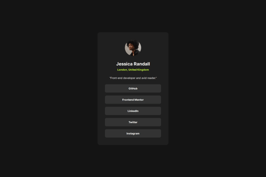


Design comparison

Solution retrospective
Using grid extensively, from centering the content in the window to begin with, and internally within the content containers. I was able to set up clamp() rules which auto-resized my content as the screen sizes changed from desktop to mobile, leaving me with only one @media rule to make. Pretty neat!
What challenges did you encounter, and how did you overcome them?I could not figure out how to get the browser to keep the content centered when the screen sizes shrank below expected, until I randomly tried keeping a grid column at min 1px in width. It worked. The browser wants to keep content visible as long as possible, and by ensuring that at least 1px of width was displayed (almost invisible on the screen), it will shrink content evenly as the screen goes really small, below the design sizes.
What specific areas of your project would you like help with?Grid tips and resources are appreciated, other than that just looking to get more practice in!
Community feedback
Please log in to post a comment
Log in with GitHub
Join our Discord community
Join thousands of Frontend Mentor community members taking the challenges, sharing resources, helping each other, and chatting about all things front-end!
Join our Discord