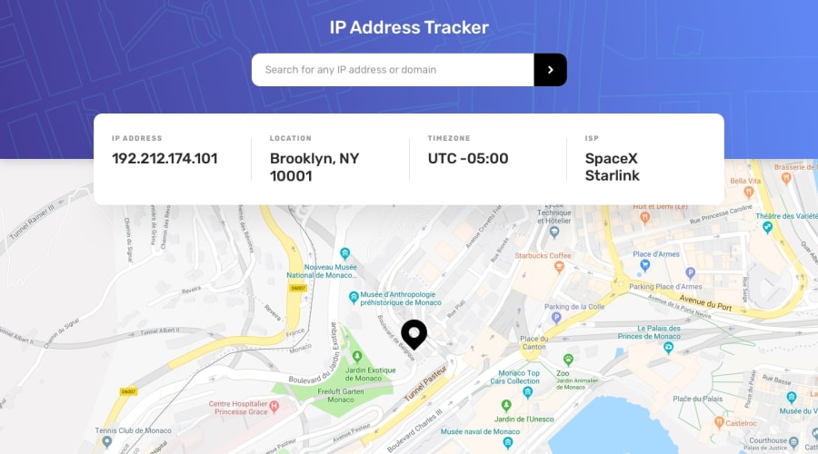
Design comparison
Solution retrospective
Any addition or advice is recommended!
Community feedback
- @SkidragonPosted over 2 years ago
It looks awesome on the styling and responsiveness. Also liked the variable names and their casing. I would make the input search box not cursor:pointer and just use the default value because it feels like a button to me. Just things to be aware of from a backend perspective: hide the api key on a reverse proxy server which talks between the client and the api in this way you can rate limit and prevent DOS (Denial of Service) attacks unless the API itself does it for you plus I can't steal your api key and make requests in my own app, and in the innerHTML for renderMap function, if the API ever becomes malicious which may never happen in this case, they could add a javascript script in the code (XSS) and make it get information about users' searches though in a more complex app, user authentication information like stealing a JWT from local storage or something. Don't spend too much time on backend stuff if its frontend that you're specializing in and need to get a job quickly.
Marked as helpful0@igbokwe-kosiPosted over 2 years ago@Skidragon I think I understand what you’re saying, but I don’t know how exactly to implement it. But I guess it means I have a lot of reading to be about backend development About the cursor: pointer, I’ll change it. Thanks!
0@SkidragonPosted over 2 years ago@igbokwe-kosi np, you don't have to implement it but being aware of it whenever you're in an interview is great.
1
Please log in to post a comment
Log in with GitHubJoin our Discord community
Join thousands of Frontend Mentor community members taking the challenges, sharing resources, helping each other, and chatting about all things front-end!
Join our Discord
