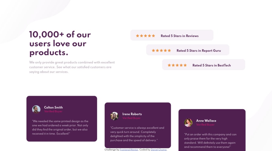
Design comparison
SolutionDesign
Solution retrospective
Second time using Flexbox, is it good?
Community feedback
- @vanzasetiaPosted about 3 years ago
👋Hi Daniel!
I have some feedback on this solution:
- The only thing that is a heading is the "10,000+ of our users love our products." sentence. For other things, you can use
strongtag or other tag instead. - Remember, only have one
h1for every page. It's a good practice nowadays. - Avoid inline styling! In large project it can cause a lot of issues.
- This should a separate element and you should not use
brto make it two lines. Try to find a better solution.
<h1> Colton Smith <br> <span class="verifiedbuyer">Verified Buyer</span> </h1>- All the person images have
coltonas the alternative text. The alternative text should be each person name. - Never use
idfor styling. It's not the purpose ofid. Use class with BEM naming convention instead. - Never use magic number to specify anything. Like the
height: 667px;of yourcontainer. - Use
remor sometimesemunit instead ofpx.
That's it! Hopefully this is helpful!
Marked as helpful1@danpthPosted about 3 years ago@vanzasetia Hey, wow, thank you! This is so detailed. Thanks for putting in your time on reviewing my code! I will be more carefull about the things you mentioned. Thank you again!
0 - The only thing that is a heading is the "10,000+ of our users love our products." sentence. For other things, you can use
Please log in to post a comment
Log in with GitHubJoin our Discord community
Join thousands of Frontend Mentor community members taking the challenges, sharing resources, helping each other, and chatting about all things front-end!
Join our Discord
