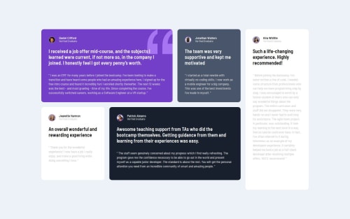
Submitted about 1 year agoA solution to the Testimonials grid section challenge
Responsive page with grid(Desktop) & Flexbox(Mobile)
sass/scss

@VSKarthikT
Solution retrospective
What are you most proud of, and what would you do differently next time?
This project I am proud of using grid to make elements stay in the respective areas and stretch them to it full width and height in the container
What challenges did you encounter, and how did you overcome them?I had difficulty with aligning items of the grid in desktop layout, I have read article about grid layout which made it easy for me to align items and gave me much deeper understanding of grid layouts
What specific areas of your project would you like help with?I would like help with reducing CSS code, how can I optimize the code, I am not sure I have use correct semantic HTML, any feedback is appreciated, Thanks
Code
Loading...
Please log in to post a comment
Log in with GitHubCommunity feedback
No feedback yet. Be the first to give feedback on V.S Karthik Tirumalasetty's solution.
Join our Discord community
Join thousands of Frontend Mentor community members taking the challenges, sharing resources, helping each other, and chatting about all things front-end!
Join our Discord