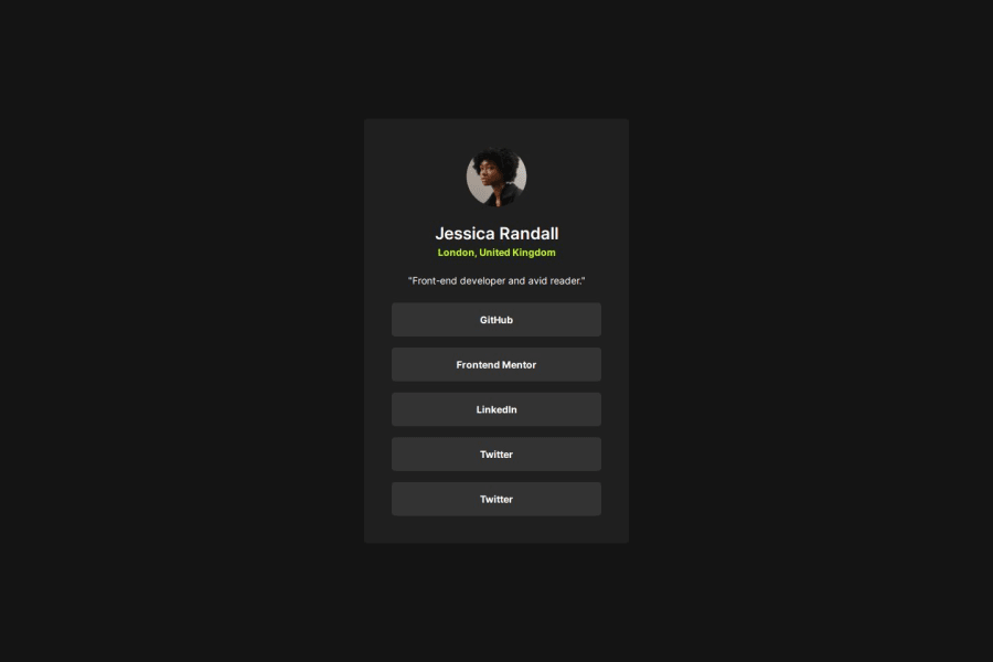
Not Found
Not Found
Not Found
Not Found
Not Found
Not Found
Not Found
Not Found
Not Found
Not Found
Not Found
Not Found
Not Found
Not Found
Not Found
Not Found
Not Found
Not Found
Not Found
Not Found

Submitted

Responsive page with grid flex media-query

P
simgeduru 50

@simgeduru

Desktop design screenshot for the Social links profile coding challenge

This is a solution for...

  • HTML
  • CSS
1newbie
View challenge

Design comparison


SolutionDesign

Solution retrospective


What are you most proud of, and what would you do differently next time?

I'm happy with my current progress, but there are places where I'm not sure at some points. I think I will move forward better after I am sure about them

What challenges did you encounter, and how did you overcome them?

i had to make calculations when setting the padding values in mobile and dextop view, this forced me

What specific areas of your project would you like help with?

How can I achieve proportional values on mobile and desktop without using media queries? I also don't find using % logical. I used media queries both to adjust the size of the div and the padding values. Is this logical? Also, I'm struggling with writing media queries, and you might find them illogical upon inspection.

Community feedback

@ZakJam

Posted

  1. When I hover my mouse over the buttons the cursor it is not a pointer.

  2. Border-radius is almost invisible, before seeing the code I thought there wasn't

3.Currently the method that I use to make a layout proportional in various size it's this : 1.I give the percentage 2. after I give the limits , min-width, min-height, max-width, max-height. 3.If I think that the limits are too low for bigger size , I use media queries and I rise up the limits. I hope you have found it helpful and it wasn't my intention to be harsh, keep going.

0
Sebastian 1,560

@dnksebastian

Posted

Hi @simgeduru,

good job on finishing your project! As for your question about media queries and responsiveness, I recommend learning more about the minimum and maximum value approach, using various css functions, such as min(), max() and clamp() in combination with relative units. You can read more about it on css-tricks.com, for example in this article:

https://css-tricks.com/beyond-media-queries-using-newer-html-css-features-for-responsive-designs/

I also recommend watching Kevin Powell's materials on YouTube :)

Another thing which I can suggest to you is using proper semantic HTML elements, for example instead of using the <div>'s for your social media links, you can wrap them in a list of anchor (<a>) elements.

Hope that helps, keep it up!

0

Please log in to post a comment

Log in with GitHub
Discord logo

Join our Discord community

Join thousands of Frontend Mentor community members taking the challenges, sharing resources, helping each other, and chatting about all things front-end!

Join our Discord