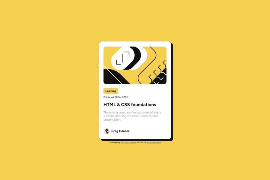
Design comparison
Solution retrospective
I am proud of how accurate and on point this project is compared to the last one, and how much effort I put in to best recreate the given design.
If I were to do this project again, I would try to pay more attention to the figma figure rather than estimate proportions on my own.
What challenges did you encounter, and how did you overcome them?The biggest challenge I encountered is dealing with the widths of card and making it not too big or too small (took me a whole day to get it right).
What specific areas of your project would you like help with?I would like to know if there is a more concise way of writing the css, because it ended up looking messy.
Community feedback
- P@danielmrz-devPosted about 1 year ago
Hello, @wassimboualam!
Your project is looking fantastic!
I'd like to suggest a way to make it even better:
- Using
marginisn't always the most effective method for centering an element.
Here's a highly efficient approach to position an element at the center of the page both vertically and horizontally:
📌 Apply this CSS to the body (avoid using
positionormarginsin order to work correctly):body { min-height: 100vh; display: flex; justify-content: center; align-items: center; }I hope you find this helpful!
Keep up the excellent work!
0 - Using
Please log in to post a comment
Log in with GitHubJoin our Discord community
Join thousands of Frontend Mentor community members taking the challenges, sharing resources, helping each other, and chatting about all things front-end!
Join our Discord
