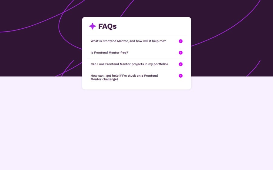
Responsive page with flexbox and media query
Design comparison
Solution retrospective
I am proud of my capacity of learning flexbox and media queries to help me stylize this project. Those are very important learnings i got from this project.
About what I would do differently next time, probably I will just use my learnings from this project and not loose much time
What challenges did you encounter, and how did you overcome them?I had a really big problem because my faq was growing up to the top. I lost lots of time trying to solve this. In the first moment, I made it a way that visualy it was all right, but it was a really incoherent solution and it was bothering me. So I researched a lot and tested options all the way, and finnaly got a good solution. If you want to know exactly how I worked on that, that's all detailed on my github
What specific areas of your project would you like help with?I would like welp on putting some animations to my faq.
Community feedback
Please log in to post a comment
Log in with GitHubJoin our Discord community
Join thousands of Frontend Mentor community members taking the challenges, sharing resources, helping each other, and chatting about all things front-end!
Join our Discord
