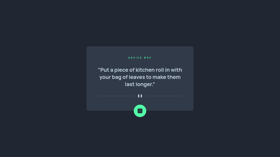
Design comparison
Solution retrospective
I would love to have any feedback
Community feedback
- @wahyufaturrizkyPosted almost 3 years ago
Hi @Ofcl-Javed Good Job Work!
this my suggestion, I think for hover on dice icon you might be put box-shadow colour, If you want to visual of shadow-colour you can simulate on this website https://cssgenerator.org/box-shadow-css-generator.html
And if you have to manage state to await the API, it would be great if you put the statement 'Loading...' so the user knowing your page is refresh or load new data
Thank you and don't forget to hit the button "Marked Helpful" is my suggested help full for you Wahyu fatur rizki
1 - @Ofcl-JavedPosted almost 3 years ago
in this hover state box-shadow is quite normal so I done it by myself and yes we can use loading feature
0
Please log in to post a comment
Log in with GitHubJoin our Discord community
Join thousands of Frontend Mentor community members taking the challenges, sharing resources, helping each other, and chatting about all things front-end!
Join our Discord