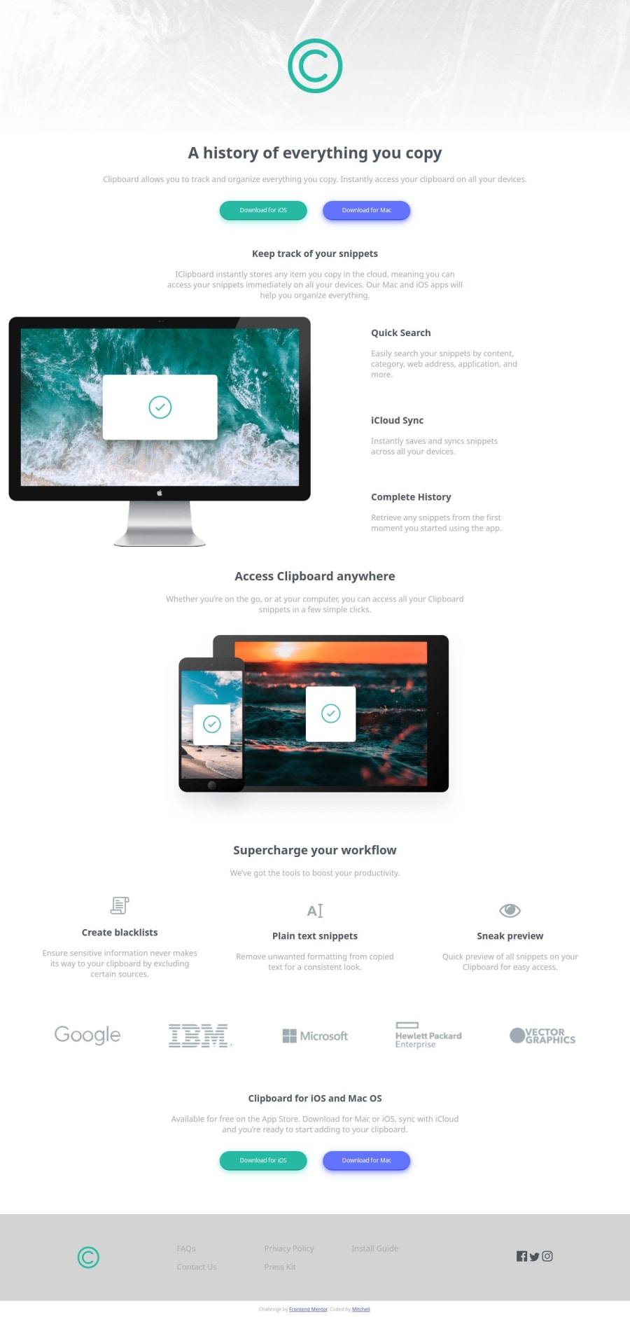
Responsive page utilizing Grid/Flexbox layout and media queries

Design comparison

Solution retrospective
I think I did an OK job with combining Grid and Flexbox. I would have liked to have just stuck with Grid, but I couldn't get it the way I wanted to.
What challenges did you encounter, and how did you overcome them?I tried a 12 column responsive view where the grid row and columns were identified per each "item" but that wasn't working, so I went to a grid-template-area format and found success there.
What specific areas of your project would you like help with?I would really appreciate any feedback on the CSS - I think it could be cleaner. So I'd like to see how others did this, and perhaps request your feedback on the CSS portion. Thank you in advance.
Community feedback
- @IonCatanaPosted 4 months ago
Hi Mitchell Lazore, i like to give you some feedback! Strengths HTML Structure: The HTML is clean and uses a proper <meta> viewport tag, ensuring responsiveness. The inclusion of external fonts (Bai Jamjuree and Inter) enhances typography consistency. Inline , <header>, <footer>) for better structure. 5. Performance Optimize images in the images folder for web use to reduce load times. Leverage CSS variables for reusable color definitions, such as: :root { --primary-color: hsl(171, 66%, 44%); --hover-color: hsl(171, 66%, 34%); }
.buttongreen { background-color: var(--primary-color); border-bottom: 2px solid var(--hover-color); }
0@W3byMJLPosted 4 months ago@IonCatana
Thanks for the feedback. I appreciate it. I like the CSS variable suggestion. I will incorporate that next time.
By optimizing the image in the images folder - do you mean properly size them in there? Or is there another recommendation you have?
Thanks again!
0

Please log in to post a comment
Log in with GitHub
Join our Discord community
Join thousands of Frontend Mentor community members taking the challenges, sharing resources, helping each other, and chatting about all things front-end!
Join our Discord