Not Found
Not Found
Not Found
Not Found
Not Found
Not Found
Not Found
Not Found
Not Found
Not Found
Not Found
Not Found
Not Found
Not Found
Not Found
Not Found
Not Found
Not Found
Not Found
Not Found

Submitted

Responsive page using viewport units, media queries, and flexbox

@ThomasH2001

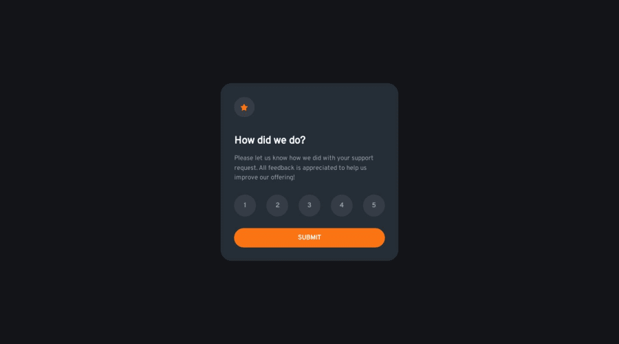
Desktop design screenshot for the Interactive rating component coding challenge

This is a solution for...

  • HTML
  • CSS
  • JS
1newbie
View challenge

Design comparison


SolutionDesign

Solution retrospective


For some reason the color of the main element is a bit different from the design even though I used the color in the style guide. Why is this?

Community feedback

M 920

@Dev-MV6

Posted

If you look carefully, the card background is not a solid color but a radial gradient of two colors. However, it seems like they forgot to include the second color in the style guide. You can use an eyedropper tool over the design image to get an approximation of the original color.

To get a more accurate result, use the following style:

main {
  background: radial-gradient(circle at top, hsl(213, 19%, 18%), #161d27);
}

Hope you find this helpful. 👋

0

Please log in to post a comment

Log in with GitHub
Discord logo

Join our Discord community

Join thousands of Frontend Mentor community members taking the challenges, sharing resources, helping each other, and chatting about all things front-end!

Join our Discord