Design comparison
Solution retrospective
I could have done the implementation by directly defining in html file and adding classes and work would be done.
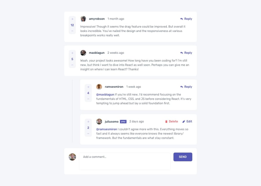
What I did was rendered entire html part using vanilla js functions, so that you throw any json data to it and it will work.
That includes zero and 1st level comments, user comment box on click of reply button (which is positioned where required i.e. for zero level comment, clicking reply adds userComment box in zero level, and clicking reply on 1st level comment brings userComment in 1st level ).
Proud of this I believe.
Also I defined work in beginning with estimated times for each part. Turns out it took almost only that amount of time (except the delete modal part....took long time to figure out how to make background darken when modal comes)
What challenges did you encounter, and how did you overcome them?Delete modal (which requires whole background to darken) was something I never did, and took long time to figure out how to do it on my own. Now that I did it, next time would be pretty easy.
Using vanilla js was a challenge in itself. Though I enjoyed it, and feel much under control than say any framework as i am directly communicating with browser.
What specific areas of your project would you like help with?JS wise - none
CSS wise - feedback appreciated on what could be better.
Help me by figuring out how to make profile icons line up with the vertical bar. For different screen sizes, it offsets. Maybe that.
Community feedback
Please log in to post a comment
Log in with GitHubJoin our Discord community
Join thousands of Frontend Mentor community members taking the challenges, sharing resources, helping each other, and chatting about all things front-end!
Join our Discord
