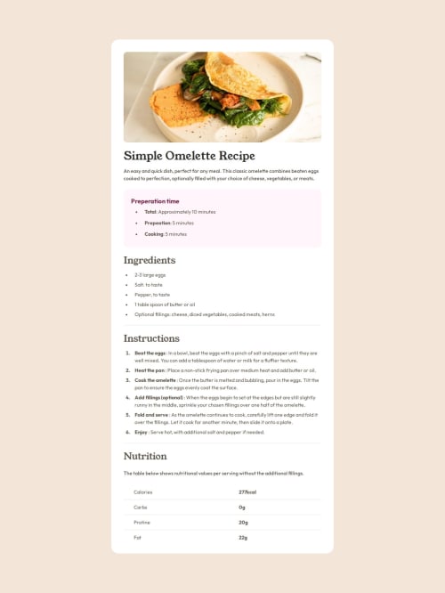
Responsive page using Tailwindcss and flexbox

Solution retrospective
I think that I've improved on designing over a static template of a webpage. The responsiveness is there and the spacing seems to be okay. I would like to improve on the cleanliness and not repeat so much of the code if possible. I want to be able to write efficient code that doesn't take up much space nor clutters the structure.
What challenges did you encounter, and how did you overcome them?The table and list were giving me a few problems. Turns out padding isn't applicable in so I had to add it to to get the desired results. I'm still working on vertically aligning the marker for list items but so far, I've had no luck.
What specific areas of your project would you like help with?I would appreciate it if someone could help me with vertically aligning the marker for the list items as reflected in the mobile view of the webpage.
Please log in to post a comment
Log in with GitHubCommunity feedback
No feedback yet. Be the first to give feedback on Samir's solution.
Join our Discord community
Join thousands of Frontend Mentor community members taking the challenges, sharing resources, helping each other, and chatting about all things front-end!
Join our Discord