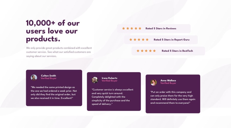
Design comparison
Solution retrospective
Wow, this one was kinda difficult to organize. A lot of divs for elements that would be misaligned on purpose and that's the first time I've been able to get desired proportions/alignment with all the elements. (Had to use a lot of margin and padding for that, though.) Tried and made everything smooth as possible when resizing the window using Flex as much as possible. Couldn't figure out if there's a way to use less padding/margin for some minor adjustments. Anyway, I'm really proud of the result. Definitely my best challenge submission! As always, any feedback is welcome, thanks in advance!
Community feedback
Please log in to post a comment
Log in with GitHubJoin our Discord community
Join thousands of Frontend Mentor community members taking the challenges, sharing resources, helping each other, and chatting about all things front-end!
Join our Discord
