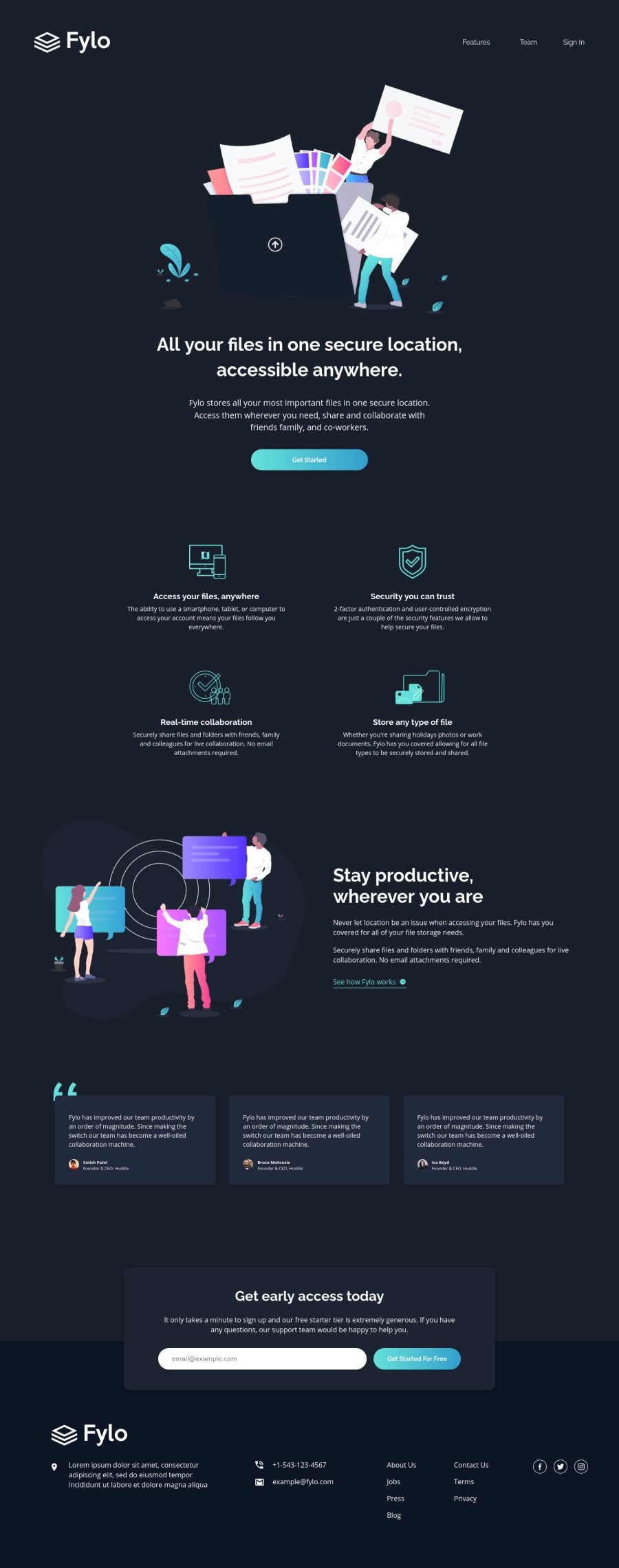
Design comparison
Solution retrospective
Leave a feedback, I will be happy to hear your opinion!
Community feedback
- @BonreyPosted almost 4 years ago
Hello, @olgak169! 👋 Fine effort on this one!
I like how your site is almost pixel perfect. I know how hard it is without any Sketch or Figma designs, so congrats on that! Also, it's great that you put in some time to add transitions and form validation. In my opinion, all this visual stuff is always worth the effort. 😊
There're a few little things you could fix to make your site look even better:
- Make your logos clickable. It'd be nicer if the user could move to the top of the page (or refresh it) on the Huddle logo click.
- Consider removing one of your
h1tags: there should be at most one such tag for a page. (You can also check your HTML Validations issue for more info.) - Add some
transition-durationto your links and buttons. That way, the overall look will be smoother.
In addition, it's great to see that you used the
:invalidselector. To be candid, I didn't know it existed before I checked your code. 😅It's great to see you're completing many challenges on this site. Keep on coding! And best of luck with everything you're learning! 😄
0@olgak169Posted almost 4 years agoHi @Bonrey ! Thanks for your kind feedback!
All your suggestions are absolutly on point. Although I didn't get the Huddle logo click one.. Glad to know you found something new and useful in my code)) Happy coding!
0
Please log in to post a comment
Log in with GitHubJoin our Discord community
Join thousands of Frontend Mentor community members taking the challenges, sharing resources, helping each other, and chatting about all things front-end!
Join our Discord
