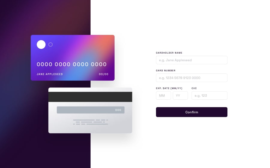
Design comparison
Solution retrospective
Well, it took a while to complete this challenge. I've learned a lot, even though I guess this is not the best solution. I had problems with the responsive part. I used this challenge to learn some sass, and I found it really useful and easy to work with.
Community feedback
- @Finney06Posted over 1 year ago
Hello there π. Good job on completing the challenge !
Here are some suggestions regarding your code that may be of interest to you.
HTML π€:
To clear the Accessibility report:
-
Wrap the page's whole main content in the
<main>
tag. -
Always avoid skipping heading levels; Starting with
<h1>
and working your way down the heading levels (<h2>
,<h3>
, etc.) helps ensure that your document has a clear and consistent hierarchy. -
Use HTML5 semantic elements such as
<header>
,<nav>
,<main>
,<aside>
, and<footer>
to define these sections. -
Use ARIA landmarks such as
<header role="banner">
and<footer role="contentinfo">
to provide additional information about the purpose of each section to assistive technologies.
Here is a web accessibility evaluation toolπ to check your webpage for any remaining errors or warnings related to landmarks.
I hope you find it helpful!π Above all, the solution you submitted is π. πHappy coding!
Marked as helpful1 -
- @LilithNixxPosted over 1 year ago
I don't know why the cards look so separated because when I open in my pc it's ok
0
Please log in to post a comment
Log in with GitHubJoin our Discord community
Join thousands of Frontend Mentor community members taking the challenges, sharing resources, helping each other, and chatting about all things front-end!
Join our Discord