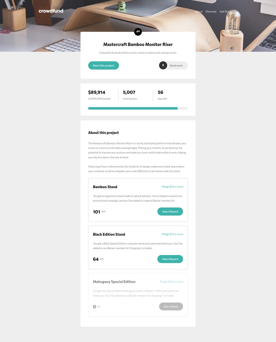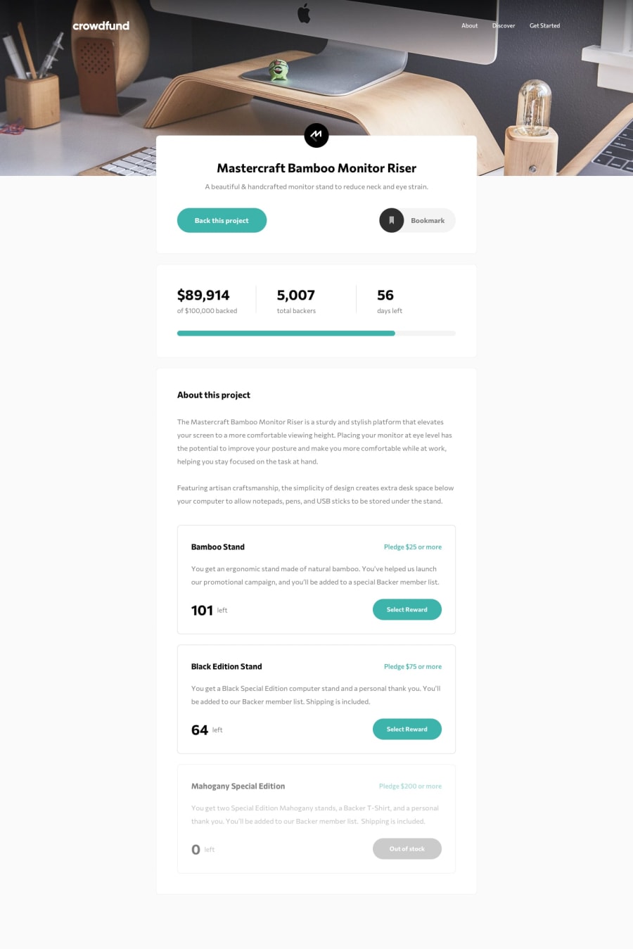
Design comparison
Solution retrospective
Really enjoyed the JS part of the challenge. Any feedback is welcome!
Community feedback
- @bimalmagar10Posted about 4 years ago
You really did great job building this site.Most of the part is all fine but what i found a bit unusual is:
- When the window resizes to about 328px then the bookmark button overlaps the back this project button.You can fix that by using
flex-direction:column. - Also, the out of stock button is clickable which seems totally unusal.You can fix it by setting
pointer-events:noneas well ascursor:not-allowed.
0 - When the window resizes to about 328px then the bookmark button overlaps the back this project button.You can fix that by using
- @pikapikamartPosted about 4 years ago
Great job you got there. The layout differs in terms of sizing but it is fine for now.
Layout also resizes good when changing to mobile state view. However, one issue that I encountered is that, I am able to click the last options which should not be interactive right. Since it is "out of stock" user should not be able to click it.
You could fix this by adding
pointer-events: noneto the selector of that button. That way, all the event will not be fired when a user clicks on it.Overall, your work is fine, good job^
0
Please log in to post a comment
Log in with GitHubJoin our Discord community
Join thousands of Frontend Mentor community members taking the challenges, sharing resources, helping each other, and chatting about all things front-end!
Join our Discord
