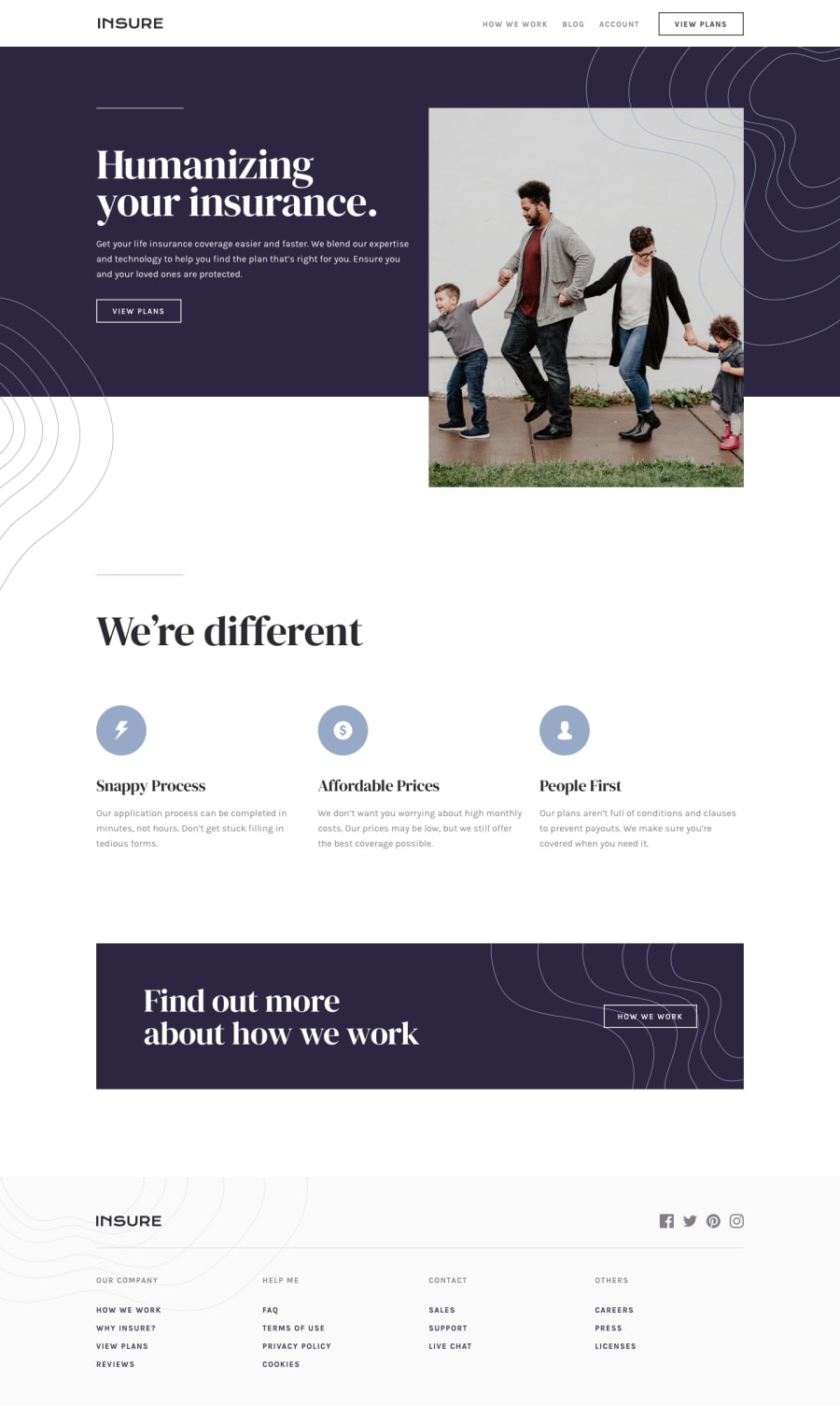
Design comparison
Solution retrospective
Hey! 😁
It's my first project where I use the hamburger navigation menu. So if you find something that should be improved, please let me know.
Community feedback
- Account deleted
Hi,
On desktop your solution looks pretty good, but the navigation links have too much space between them.
-
I like how it's responsive, everything just works on all screen sizes. & how the mobile menu animate is pretty nice.
-
But there's just one problem; go activate the mobile menu then return to desktop while it's still active, and try to scroll down the page... It doesn't let you, don't know why.
Overall is it looks good.
Marked as helpful0@isaacnovaesPosted about 3 years agoHello @thulanigamtee ! 😁
First of all, thank you for your feedback. From your suggestions:
- I reduced the nav links size
- Well, I don't think that not being able to scroll when the hamburger menu is active is a problem. After all, I programmed it 😂. I just toggle the overflow-y to hidden on the body with JS when the hamburger menu is active. I did so because I find it annoying if I can scroll when this menu is active, simply because when you access the menu, the only thing you want is the menu, not the rest of the website. Therefore, in my point of view, not scrolling when the menu is active is a way to improve UX.
Thank you once again! 😁😁
0 -
Please log in to post a comment
Log in with GitHubJoin our Discord community
Join thousands of Frontend Mentor community members taking the challenges, sharing resources, helping each other, and chatting about all things front-end!
Join our Discord
