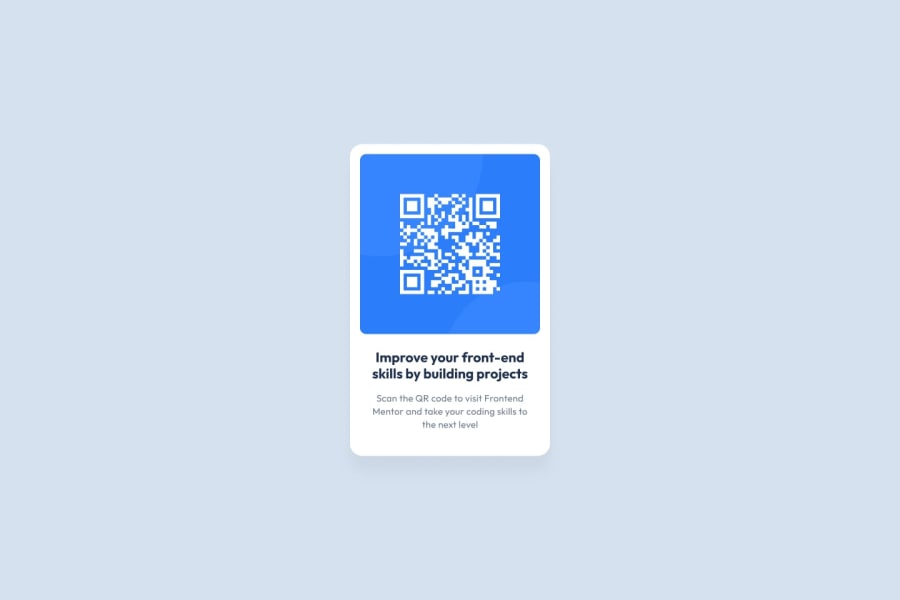
Design comparison
Solution retrospective
I would be every glad if anyone could correct me if he or she sees a mistake in the coding
Community feedback
- @saogijiPosted over 2 years ago
Great work @MaxiTeddy, in addition to the suggestions by @TheJoxel, you should also checkout the report, I can see you have 3 accessibility and one HTML issues, the report is great tool to maintain good practices in writing your codes. Good luck
Marked as helpful0 - @TheJoxelPosted over 2 years ago
It is very good work.
- Personally I would give 10px more padding to the card.
- If you look at the design the title only covers 2 lines and in your solution it covers 3 lines.
- The description in the design only has 3 lines and your solution has 4. You could correct that with a more width
Marked as helpful0@MaxiTeddyPosted over 2 years ago@TheJoxel thanks mate, I appreciate it. I will apply you feedback as soon as possible
0 - @sarfarazstarkPosted over 2 years ago
You did so close but instead of using div use html5 tags for containers and add flex style in your body also check your style-guide.md for text colors and size add lang attribute in html tag
1
Please log in to post a comment
Log in with GitHubJoin our Discord community
Join thousands of Frontend Mentor community members taking the challenges, sharing resources, helping each other, and chatting about all things front-end!
Join our Discord
