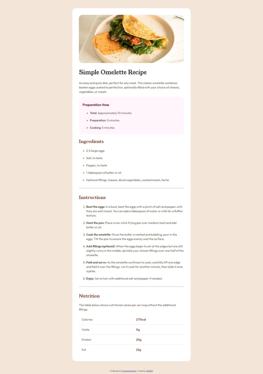


Design comparison

Solution retrospective
Being honest, I had no idea after adding some tags on HTML. I didn't know what to begin with in CSS, but I started from small things like colors, and searched everything I need and tried it. I'm proud that I finally made it, including the responsive part!
What challenges did you encounter, and how did you overcome them?It was my first time to build a responsive web design, so I had to study about it. I studied about media query and made the background color and some margin settings in it so that it can be changes depends to the size of browser
What specific areas of your project would you like help with?In my CSS code, I feel like things are not really ordered. I just looked for the properties I need, try it and add it without any steps or any rules. So I think I need some advise about how to order them or the steps for using CSS.
Community feedback
- @manishsinghrajPosted 11 months ago
Its up to your preference to decide the ordering.
Personally I prefer to follow the hierarchy of the HTML structure when arranging CSS properties. I begin by organizing elements based on their position in the HTML hierarchy.
for individual properties I typically start with layout adjustments, like padding and margin, and then styling properties. I group related properties together for easier reference.
For example:
.container {
  display: flex;
  justify-content: center;
  align-items: center;
  padding: 20px;
  margin: 10px;
  background-color: #f0f0f0;
  border: 1px solid #ccc;
  border-radius: 5px;
  font-family: Arial, sans-serif;
  font-size: 16px;
}
Marked as helpful0@corkangPosted 11 months ago@manishsinghraj Thanks for the comment 🙂!!! Layout first and then styling sounds reasonable. I'll try it in my next project.
1

Please log in to post a comment
Log in with GitHub
Join our Discord community
Join thousands of Frontend Mentor community members taking the challenges, sharing resources, helping each other, and chatting about all things front-end!
Join our Discord