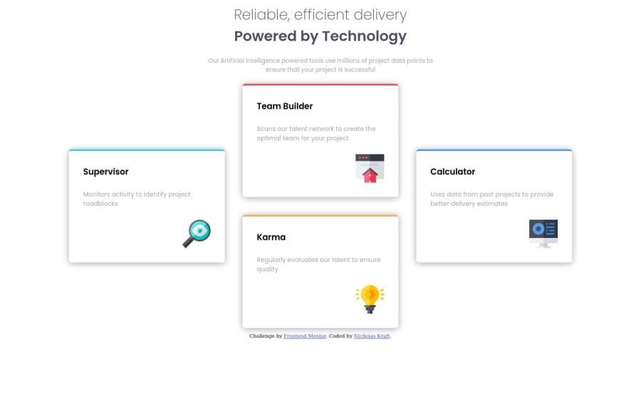
Responsive page using Media Queries, Grid, and Flexbox
Design comparison
Solution retrospective
This is my first attempt at creating a responsive page. This is also the first time I've posted any of my code anywhere but github. Genuinely any feedback would be greatly appreciated.
Community feedback
- @ApplePieGiraffePosted almost 4 years ago
Hey, congratulations upon completing your first Frontend Mentor challenge, Nicholas! 🎉
Good work on this one! Your solution looks good and responds nicely! 👏
I suggest using a single
<h1>
tag for the heading of the page (since it is really just one heading, not two separate headings). You can easily use a<span>
tag to style the different parts of the heading differently. 😉Also, a little more space between the top of the page and the heading (as in the original design) would be nice.
Keep coding (and happy doing, too)! 😁
1@nicholask98Posted almost 4 years agoHi ApplePieGiraffe! Thank you for the feedback. I took your suggestions and worked on them a bit more and I like the result a lot better now. Thanks for your time :)
0 - @MasterDev333Posted almost 4 years ago
Awesome, you did a great job. You used CSS-Grid correct way. However, it would be great if you remove margins of body tag and container. If you add some spacing for container, use paddings rather than margin. Hope this helps. Happy coding~ :D
1@nicholask98Posted almost 4 years agoHi MasterDev! Thanks for the suggestions! I added some spacing using paddings rather than margins and I like the way it turned out a lot better. I appreciate your time!
0
Please log in to post a comment
Log in with GitHubJoin our Discord community
Join thousands of Frontend Mentor community members taking the challenges, sharing resources, helping each other, and chatting about all things front-end!
Join our Discord