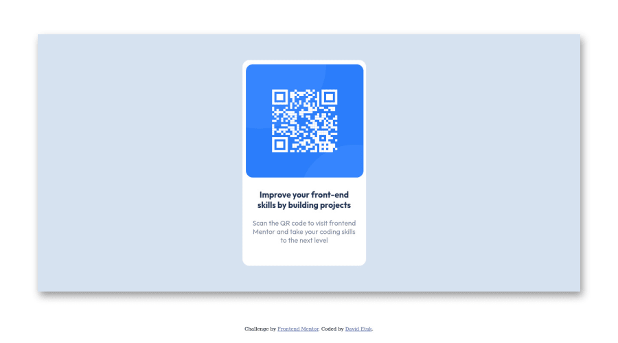
Design comparison
SolutionDesign
Solution retrospective
◦ Positioning the elements at the center was a bit tasking. ◦ I am not sure I got the positioning spot on. ◦ Is there a better way to position elements?
Community feedback
- @shashreesamuelPosted over 2 years ago
Hey good job completing this challenge
Keep up the good work
Your solution looks great however I think that the background color is supposed to be on the body element.
In terms of the accessibility issues simply wrap all your content between main tags
Cheers Happy coding 👍
Marked as helpful1 - @JoseAngaraPosted over 2 years ago
Hi, to align elements you can use Flexbox, in this case you can use
body {
  display: flex;
  flex-direction: column;
  align- items: center;
  justify-content: center;
}
Of couse, there are more ways to do this, like using Grid, flex containers or transformations.
1
Please log in to post a comment
Log in with GitHubJoin our Discord community
Join thousands of Frontend Mentor community members taking the challenges, sharing resources, helping each other, and chatting about all things front-end!
Join our Discord
