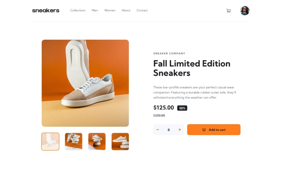
Design comparison
Solution retrospective
Hello All,
Though it took me days to complete this working version, but i know there are some rules i broke or didn't follow which may make code optimization on a negative side.
I'll really appreciate your review to help me make corrections and create a better code.
Thank you
Community feedback
- @darryncodesPosted about 3 years ago
Hi Da'keshra,
Overall not a bad solution.
However i'd remove all your styles from
.containerand try this on your<body>. Also you've used the wrong flexbox property in your declaration:align-content: center;it should bealign-items: center;body { font-family: "Red Hat Display"; font-size: 16px; background: url(img/pattern-background-desktop.svg); background-repeat: no-repeat; background-size: 100% auto; // updated to auto, would recommend removing the image at mobile screen widths background-color: hsl(225, 100%, 94%); display: flex; justify-content: center; align-items: center; min-height: 100vh;1 - @MikevPeerenPosted about 3 years ago
Hey @daKeshra7,
It appears you have added the wrong solution for this challenge.
1@daKeshra7Posted about 3 years ago@MikevPeeren Yes didn't even know how i made the such mistake.
0
Please log in to post a comment
Log in with GitHubJoin our Discord community
Join thousands of Frontend Mentor community members taking the challenges, sharing resources, helping each other, and chatting about all things front-end!
Join our Discord
